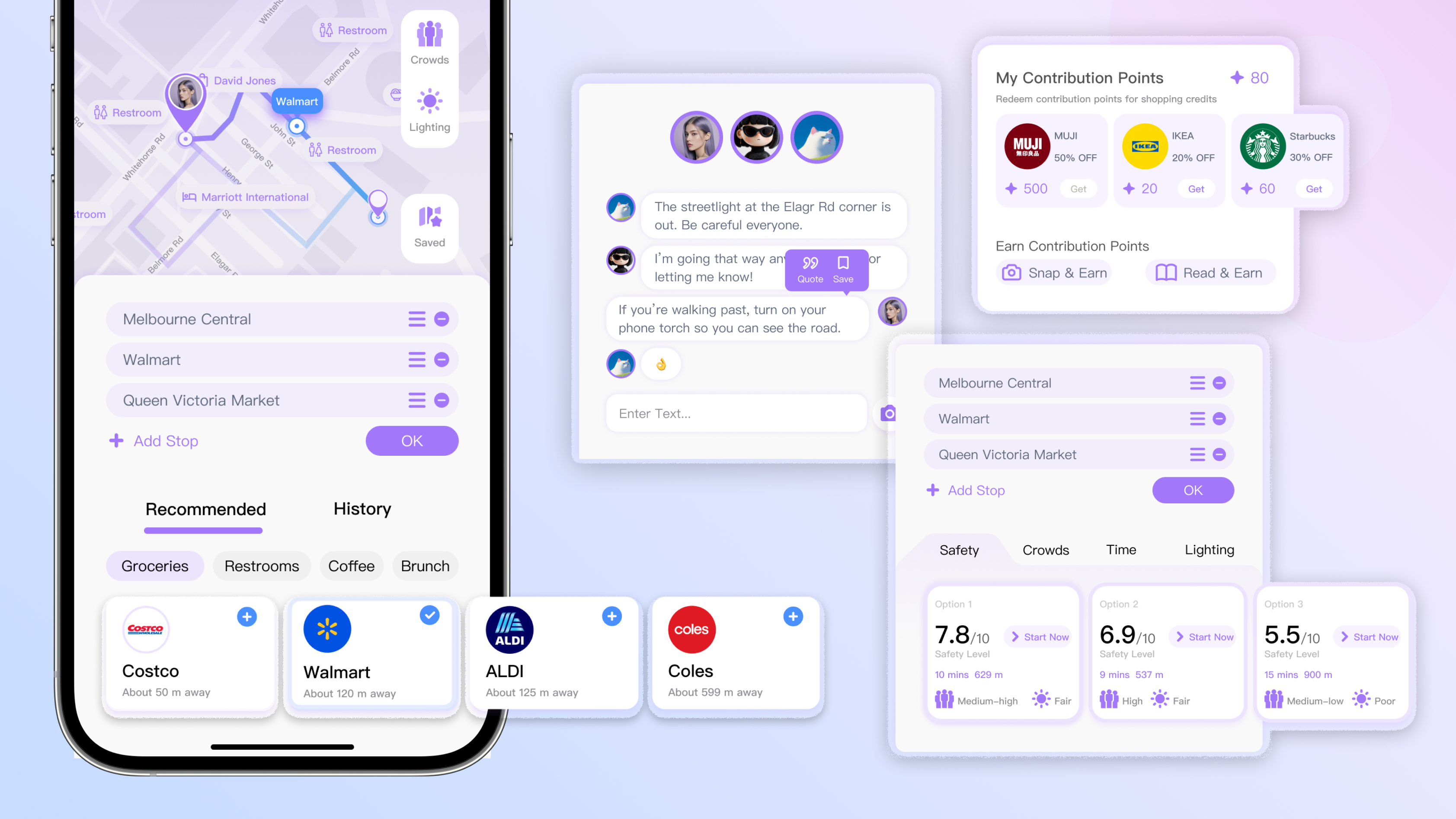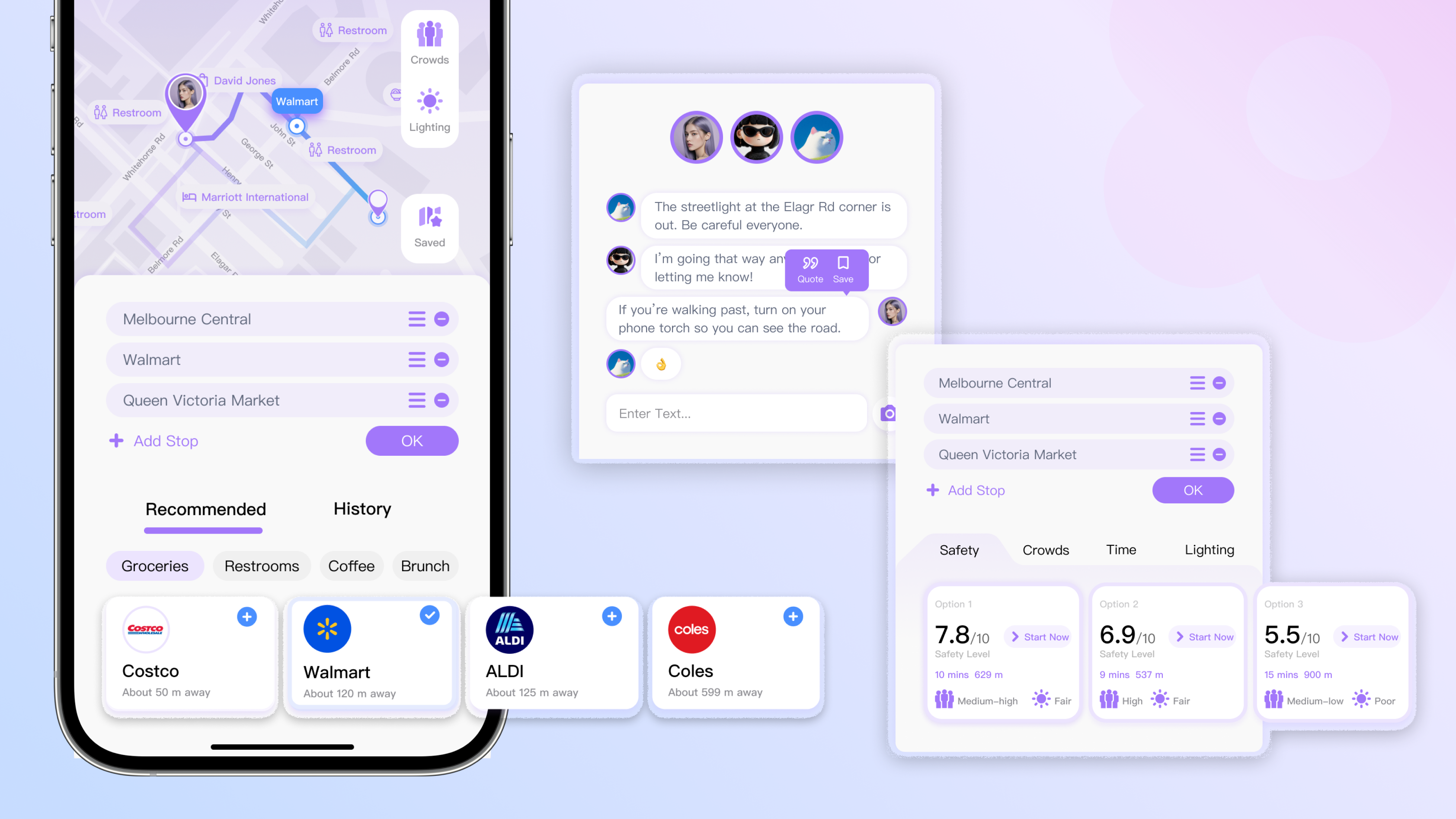
FIG 1. Tools in This Project
Overview
This NDA (Non-Disclosure Agreement) project focused on optimising the B2C website experience for a commercial education provider using Squarespace. The challenge was not to add more features, but to improve clarity. Like helping prospective parents and students quickly understand what the organisation offers, which programs are available, and how to take the next step.
Working within real business constraints, I redesigned key information structures and user journeys to better support both business objectives and user needs. The project reinforced an important lesson for me is in commercial products, effective design is often less about adding interactions and more about reducing friction, improving clarity, and helping users make confident decisions.
*Due to a Non-Disclosure Agreement (NDA), specific designs and business details cannot be shared. This case study focuses on my design process, decision-making, and key learnings.
Timeline
Nov 2025 - Jan 2026, 2 months
Role
Digital Media Associate Designer — UI & UX Design, Visual Design
Design Skills
Cross-Platform Design, Responsive Design,
E-commerce Platform Design
Tools
Squarespace, Figma, Adobe Suites
00 PROJECT DESCRIPTION
A B2C commercial website optimisation project for an education provider, focused on improving information clarity, navigation efficiency, and cross-platform usability.

01 CHALLENGES
01-1 Weak Business Communication
The organisation's value proposition was not communicated clearly during the first visit, making it difficult for users to understand what differentiated the organisation and why they should continue exploring.
01-2 Unclear Information Hierarchy
The website contained a large amount of content, making it difficult for parents to quickly identify the organisation's core services, available programs, and key information.
01-3 Ineffcient User Journey
Several key user journeys contained unnecessary navigation steps. For example, after selecting a course, users were not guided directly towards the expected next action, creating unnecessary friction during the enrolment process.
01-4 Cross-Platform Consistency
The website was built on Squarespace, where layouts and interactions that worked well on desktop did not always translate effectively to mobile devices. The redesign focused on creating a more consistent experience across both platforms while working within platform constraints.

02 DESIGN STRAEGIES
02-1 Aligning Design with Business Goals
The redesign began with understanding how the organisation communicates its services and values to parents.
To improve first impressions, a concise introduction to the organisation and its educational mission was placed prominently on the homepage, followed by clear entry points to the main course categories. This structure helps parents quickly understand who the organisation is, what it offers, and where to explore next.
To make each programme easier to recognise, every course was paired with carefully selected visual imagery that reflected its learning focus. Rather than serving as decoration, these visuals became part of the information hierarchy, helping users scan and differentiate content more efficiently.
Beyond the homepage, I also redesigned key brand introduction pages by incorporating imagery that reflected the organisation's culture and educational philosophy. This strengthened the overall narrative and created a more cohesive experience across the website.

02-2 Restructing Information Architecture
To improve navigation and reduce information overload, I first mapped the existing information architecture to understand how content was organised across the website.
Working closely with the Design Lead, Education team, and Marketing team, I identified overlapping content and reorganised the site structure into a clearer and more streamlined hierarchy. The redesign balanced business priorities, content strategy, and user needs while remaining within the technical constraints of Squarespace.
Rather than stopping at high-fidelity mock-ups, I translated the redesigned interfaces into production using Squarespace, ensuring the final website accurately reflected the intended interaction and responsive behaviour.

02-3 Designing Within Platform Constraints
During the early stages of the project, I found that Squarespace handled desktop and mobile layouts differently. A layout that worked well on desktop often needed further adjustments on mobile, especially for spacing, readability, and interactions.
After recognising this, I changed the way I approached every screen. Instead of designing for desktop first and adapting later, I considered both platforms at the same time. This helped me create interfaces that were easier to implement while keeping the experience consistent across devices.

03 KEY TAKEAWAYS
Skillsets