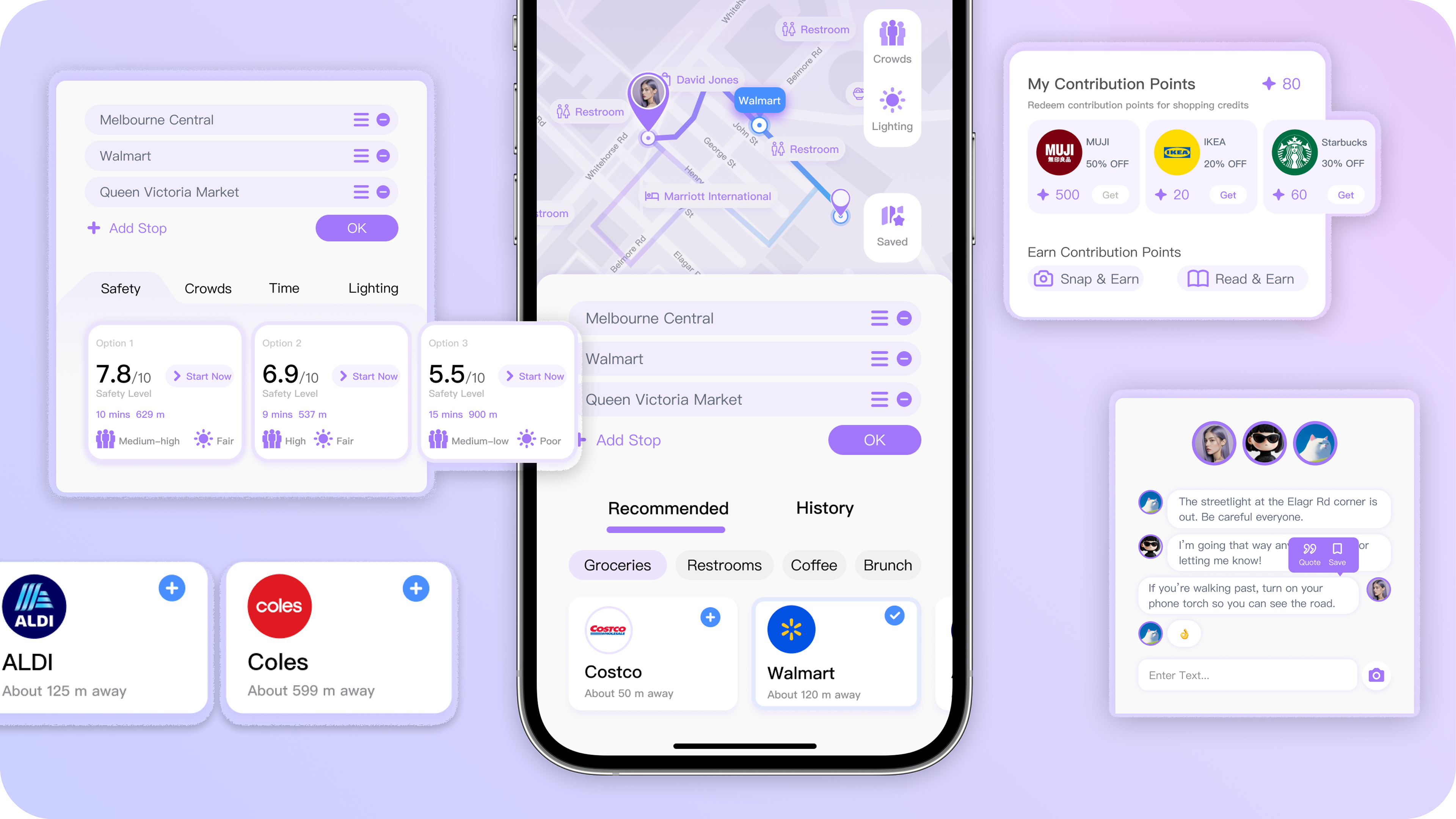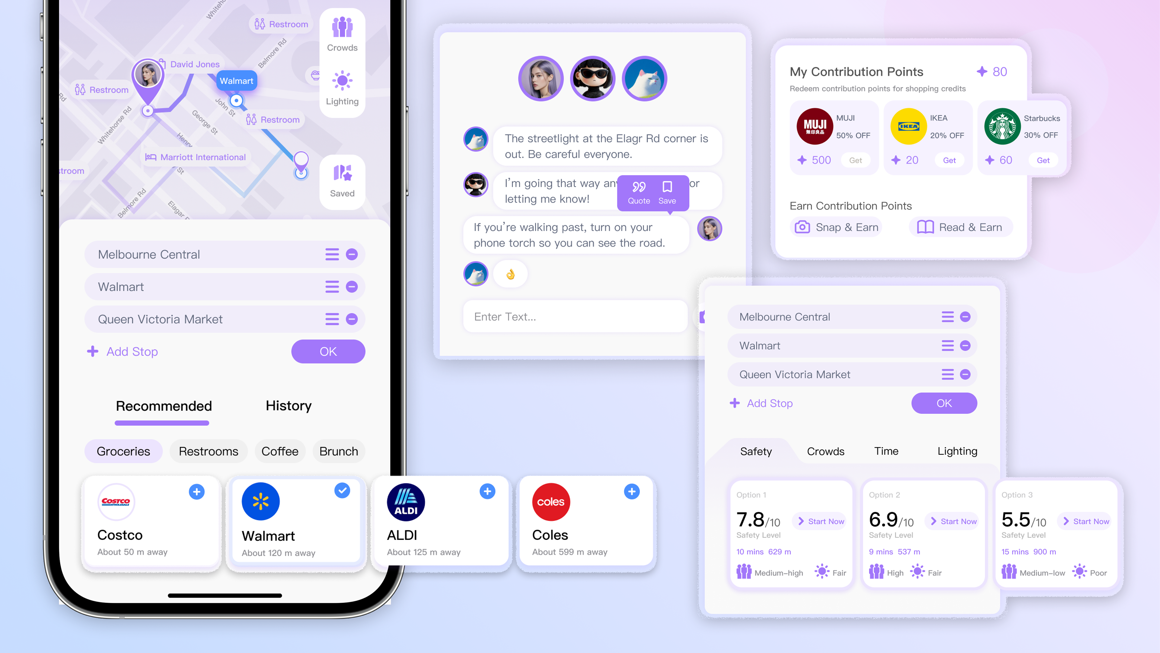
FIG 1. User Interface

Overview
Safe Life is a safety-focused mobile app designed around women’s everyday walking routines. By integrating traditional safety features into daily services and incentive-based mechanisms, the app encourages users to shift from reactive emergency responses to proactive risk avoidance. Unlike other women’s safety apps, it helps women’s sense of walking safety while balancing user retention, continuous safety data updates, and commercial sustainability, offering a viable approach for the long-term operation of women’s safety applications.
*This app was redesigned and localized from Chinese to English, with adjustments for text length, hierarchy, and tone.
Timeline
Oct 2024 - May 2025, 7 months

Design Skills
Service Design, User-Centered Design
Team
Jackie Xie — Lead Designer
User Research, UI & UX Design, Motion Design, Prototyping
Lith He — UI & UX Designer
User Research, UI & UX Design, Prototyping
00 HIGHLIGHTS
Transforming women's safety from an emergency tool into a trusted companion for everyday travel.

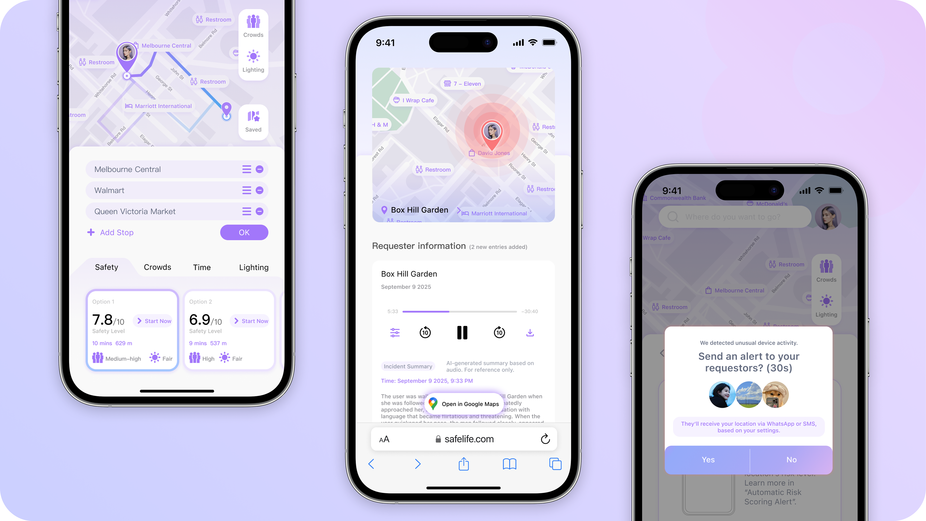
FIG 2. User Interface

01 CONTEXT

A common problem in most women's safety products.


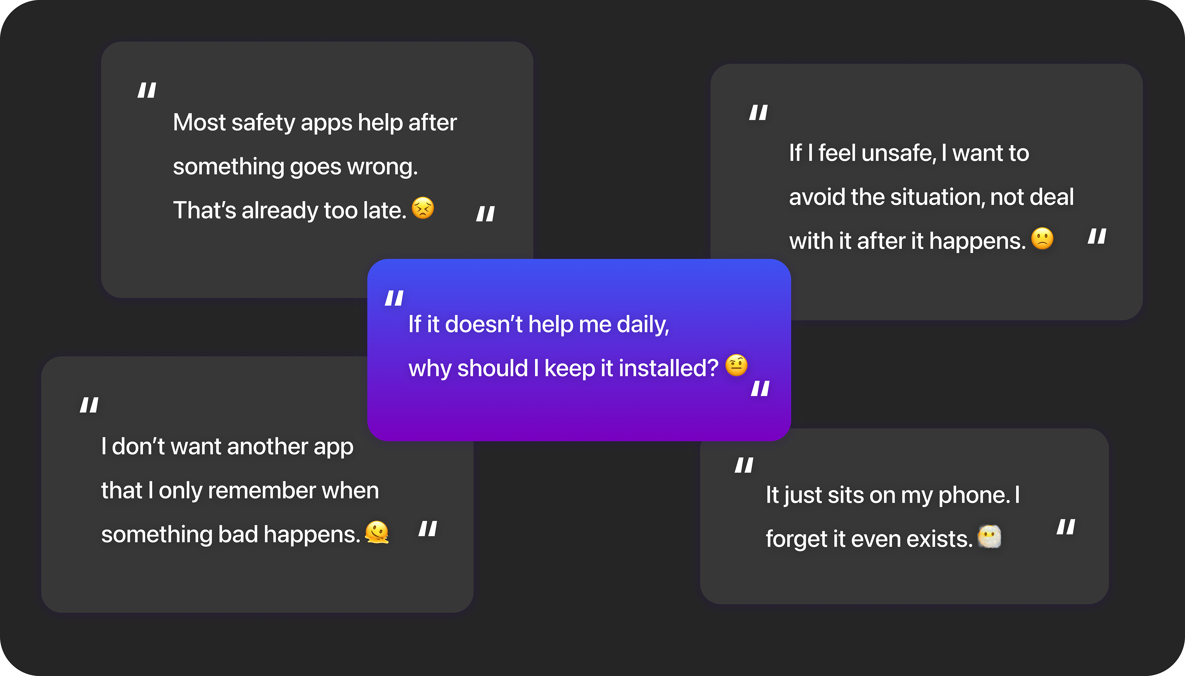
Current safety apps and products focus on emergency response rather than risk prevention and struggle with long-term user retention due to limited everyday use cases (FIG.3).

FIG 3. Pain Points From User Interviews

At the same time, common safety products on the market typically structure their core features around different levels of user safety needs, including Trip planning, Safety companion, and Emergency assistance.
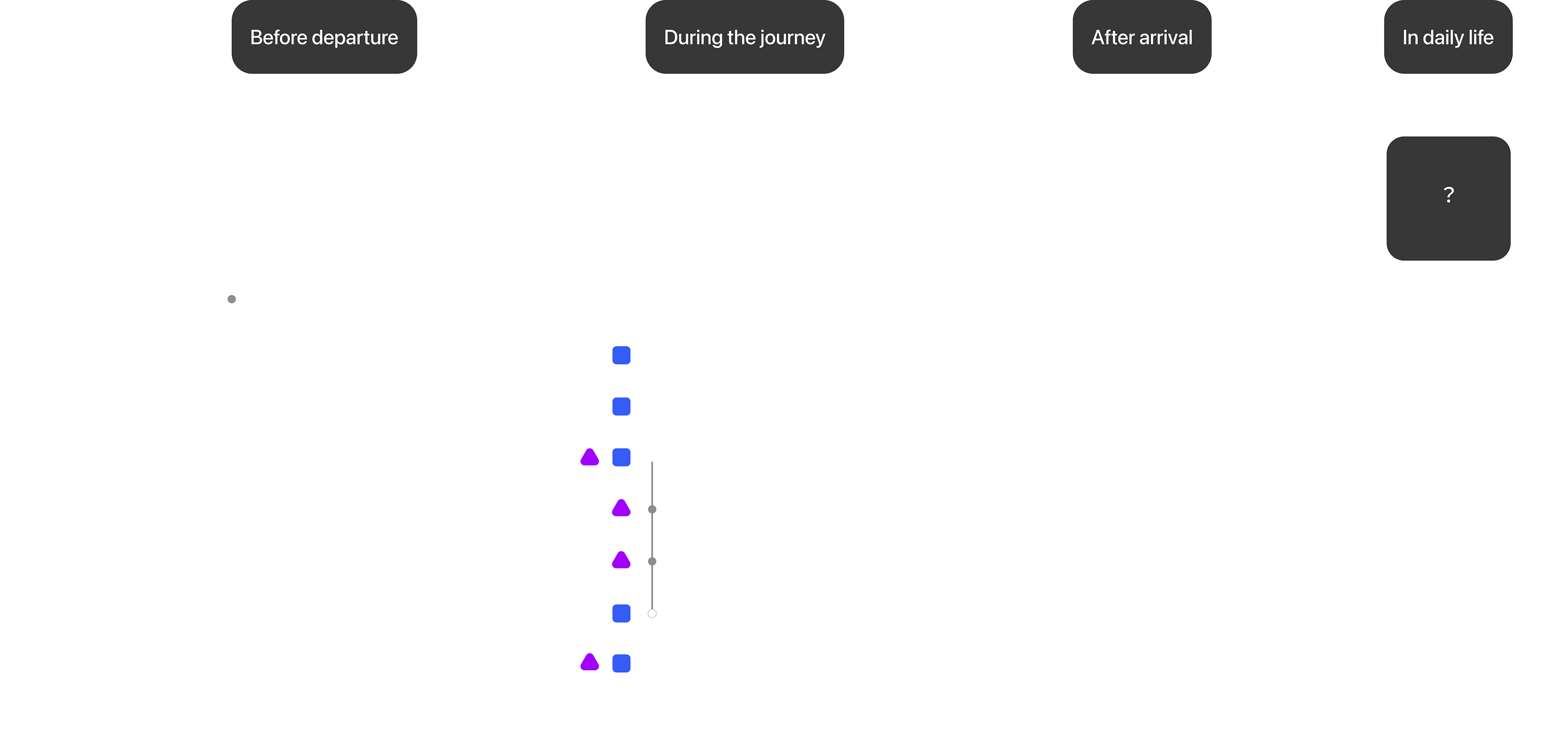
Within a typical user journey of safety products, two key roles are usually involved: the product user and the helper. Notably, the Safety companion and Emergency assistance features require more interaction between these two roles, which often leads to more complex workflows (FIG.4).

FIG 4. User Journey Map

By mapping the interactions between users and helpers throughout the user journey, we identified three priority levels of key challenges.
Key Challenges
02 SOLUTIONS

As digital products increasingly assume safety roles in everyday life, it is time to rethink how safety solutions support women beyond emergencies. To address the key challenges, we developed three design principles to guide the project.
Design Principles
To help users assess potential risks before travelling based on design principles, I needed to make route safety visible and comparable. Based on user research, competitor analysis, and the availability of safety-related data, I developed a framework for evaluating route safety (Safety Rating System).

However, reliable safety information depends on continuous and authentic user contributions, while most safety products struggle to maintain long-term engagement. Through research, I found that women's travel experiences are shaped not only by safety concerns, but also by everyday needs such as shopping, dining, and commuting.
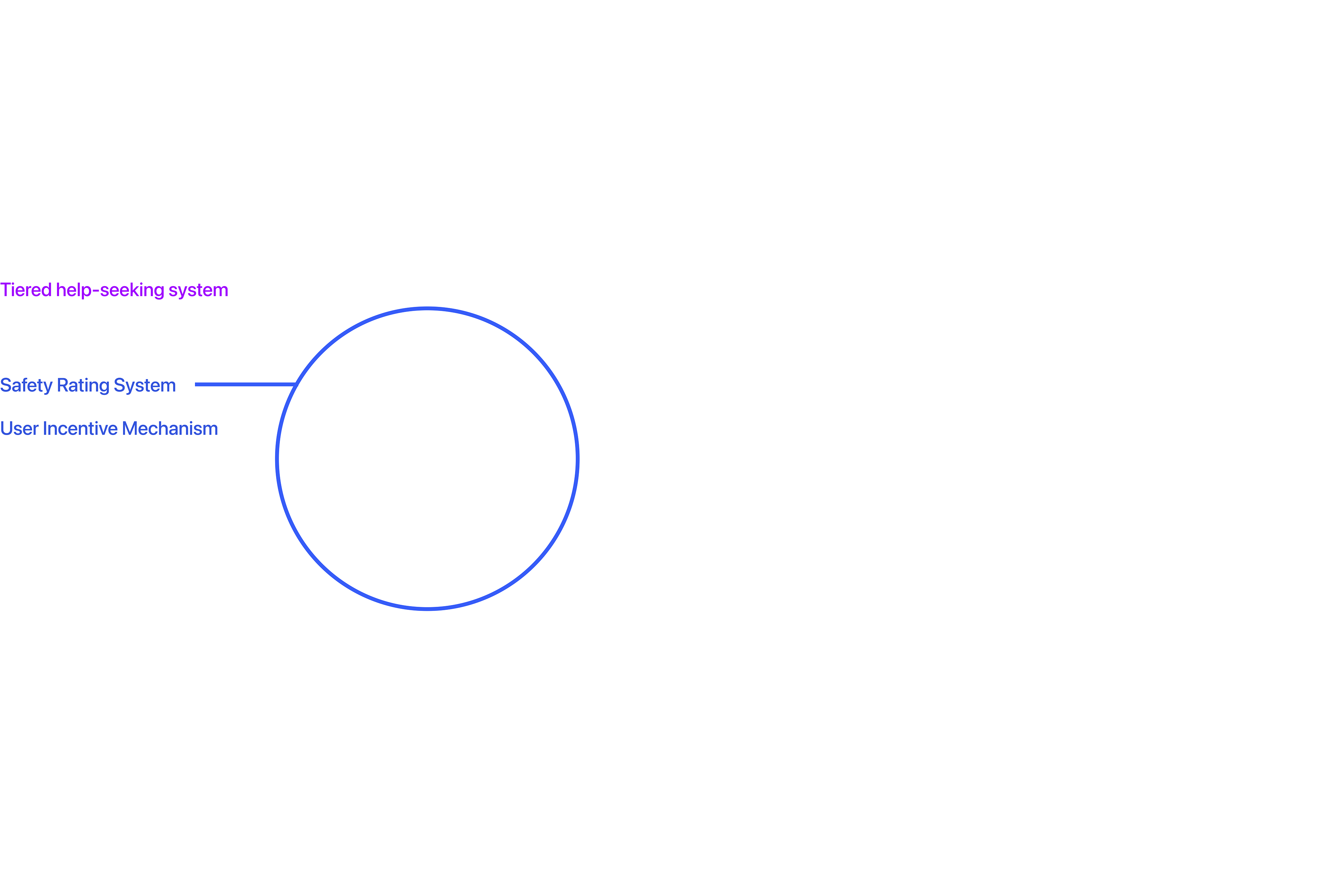
FIG 5. App Service Framework

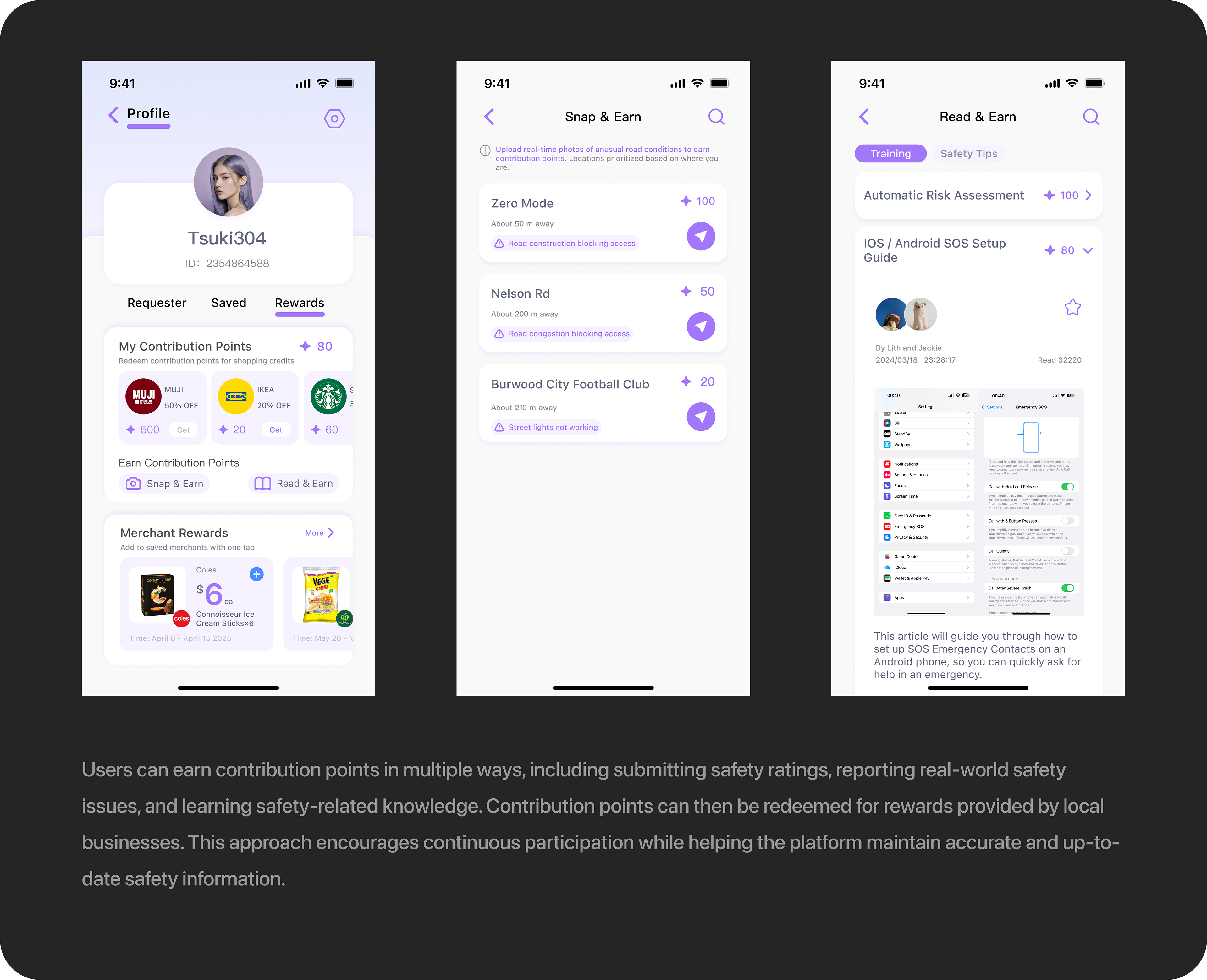
This led me to connect safety participation with existing daily behaviours. Users can earn contribution points by submitting safety ratings and feedback, which can then be exchanged for rewards and discounts provided by local businesses.

This approach creates value for all stakeholders involved: users receive tangible benefits, businesses gain visibility and potential customers, and the platform continuously collects and updates safety data. As more users participate, the quality and reliability of safety information improve over time, creating a sustainable ecosystem that benefits users, businesses, and the platform alike (FIG.5).

03 DESIGN DECISIONS
03-1 Distributed Rating vs. Post-Trip Rating

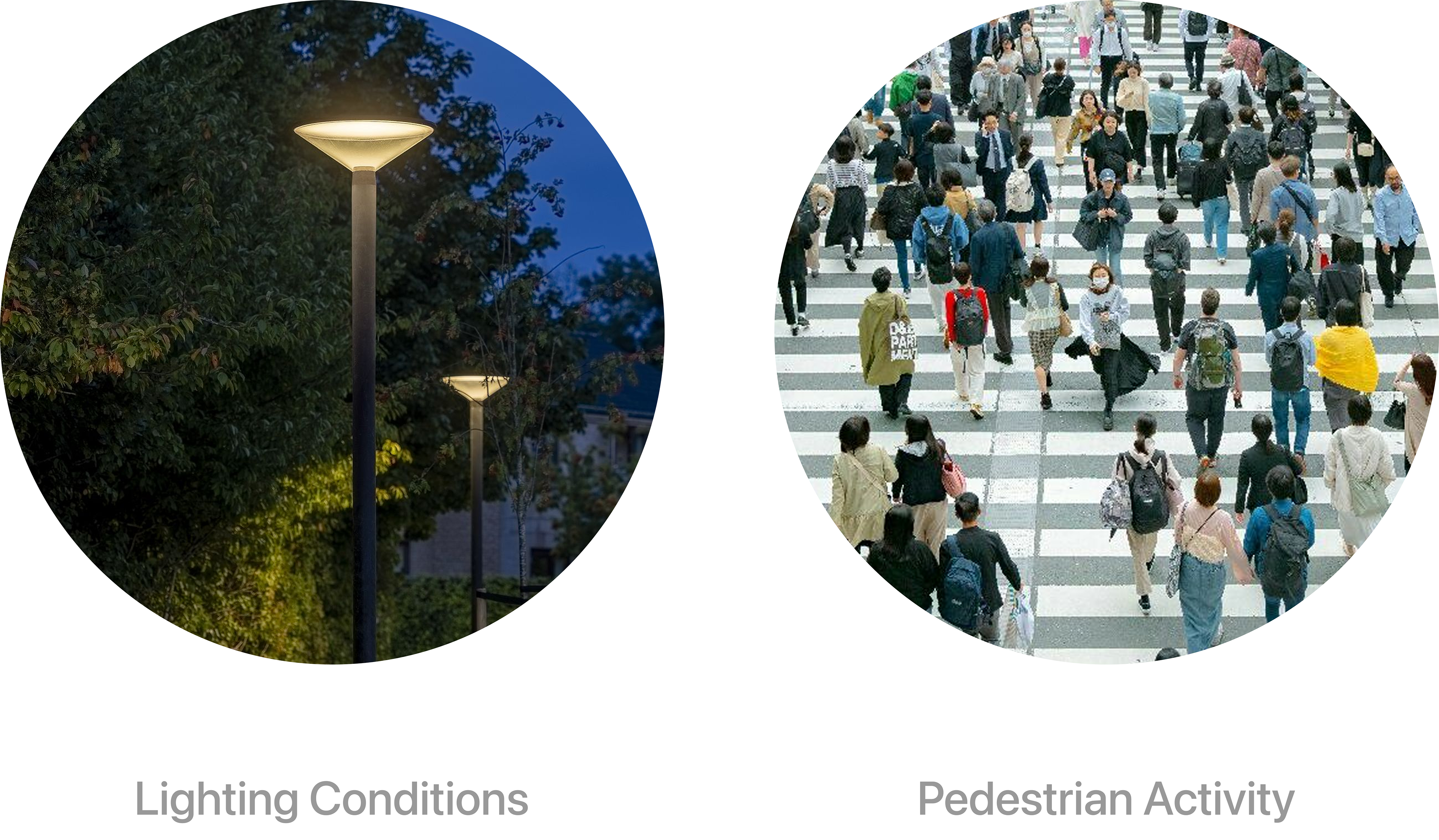
FIG 6.  Women's Safety Key Factors While Walking
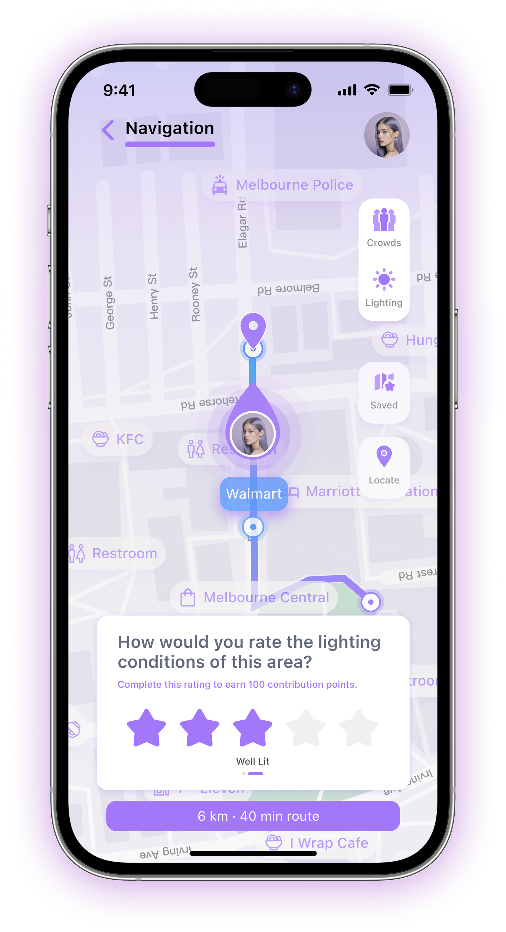
User research identified lighting conditions and pedestrian activity as two key factors influencing women’s perceived safety while walking. Both data sources could be accessed through map APIs and were combined into a Safety Rating System (FIG.6).
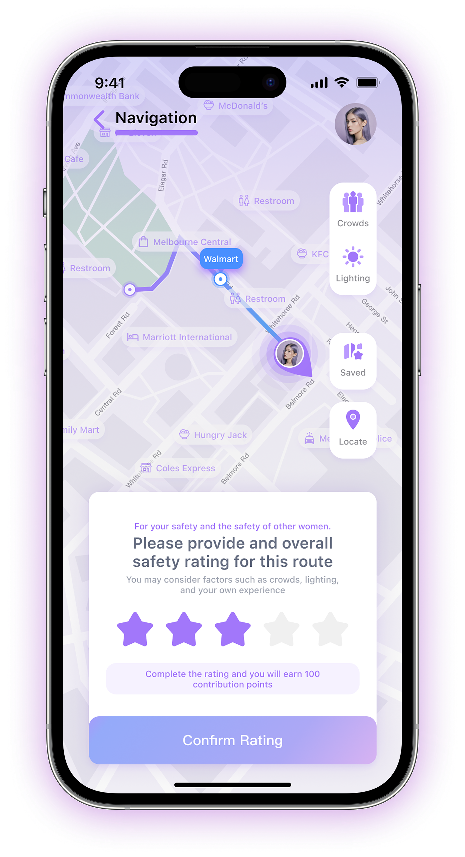
The resulting score provides a safety reference during route planning. As the system relies on continuously updated community data, a safety feedback feature was integrated directly into the route planning experience to support ongoing contributions.
Challenge
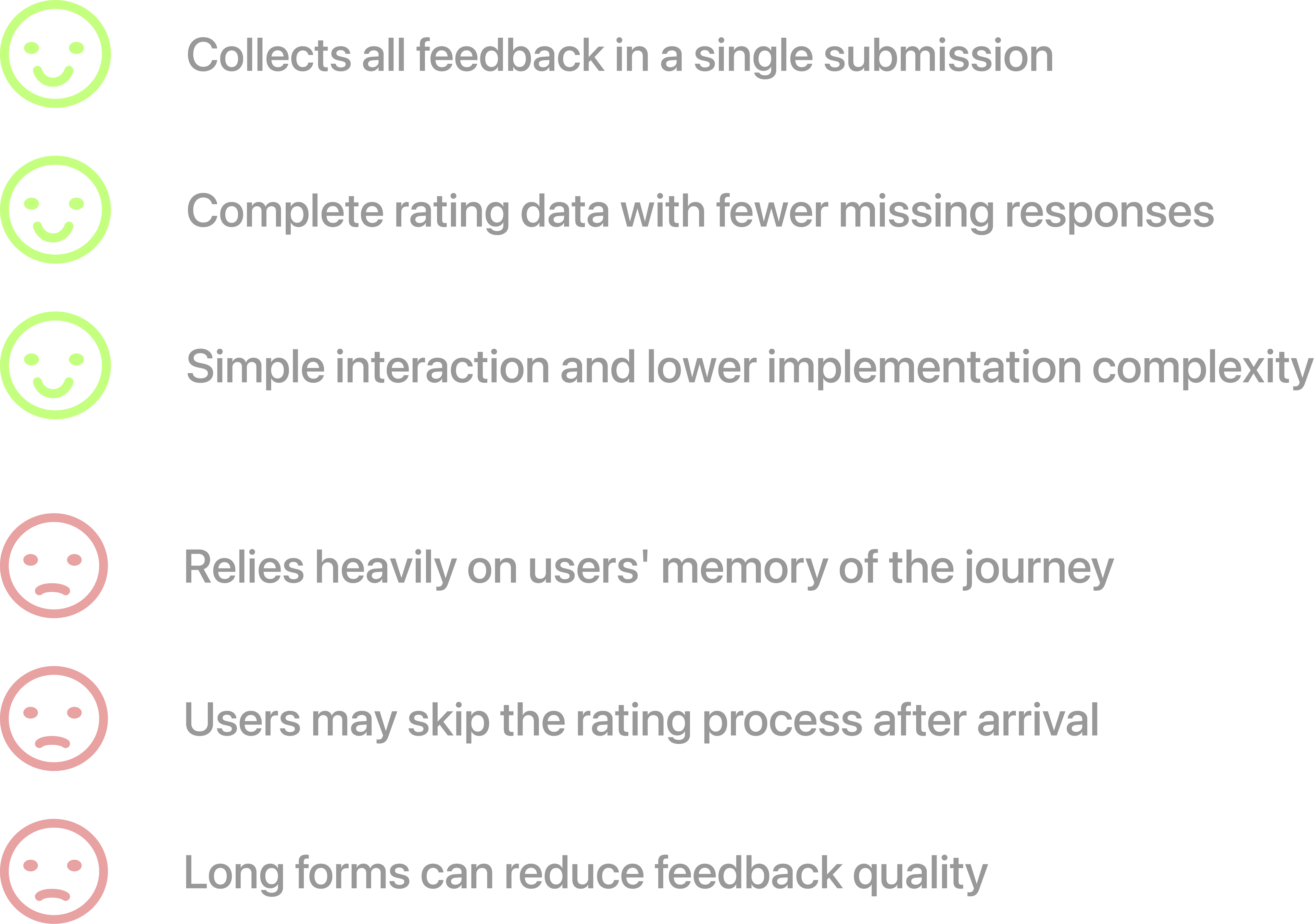
The safety scoring system relies on continuous and reliable user-generated data, but lengthy rating processes often lead to incomplete or low-quality feedback.
We explored two approaches:
Option A: Distributing rating tasks throughout the journey (FIG.7)
Option B: Collecting all ratings at the end of a journey (FIG.8)
Option A
Option B

FIG 7. Rating Through the Journey

FIG 8. Rating After the Journey
FIG 9. Design Decision 1

Why?
Safety perceptions can change throughout a journey. Capturing feedback closer to the moment of experience produces more accurate and location-specific data, while reducing the burden of completing a lengthy rating form after arrival.
03-2 Supporting Different Levels of Risk

FIG 10. Common Support Contacts

User research and competitor analysis showed that women typically turn to only two types of contacts in unsafe situations: family, friends, and the police (FIG.10).
Most existing safety products are designed around these two options. However, many situations fall somewhere between feeling unsafe and requiring immediate emergency intervention.
Challenge
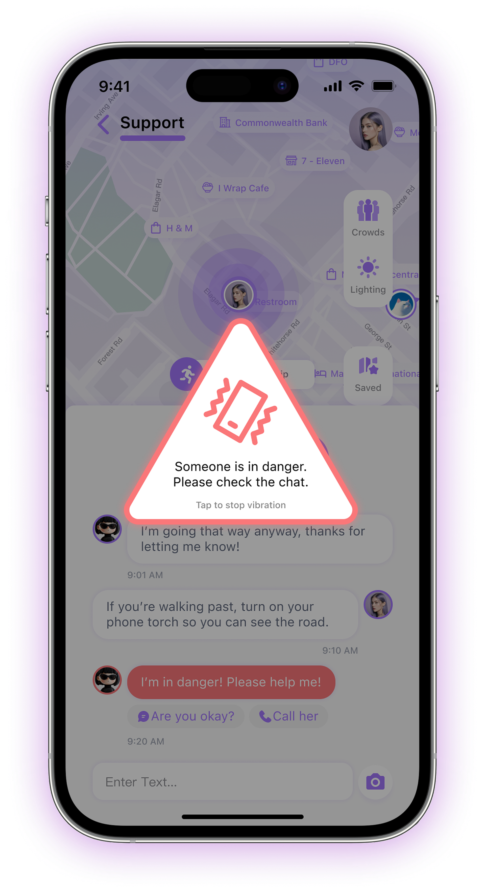
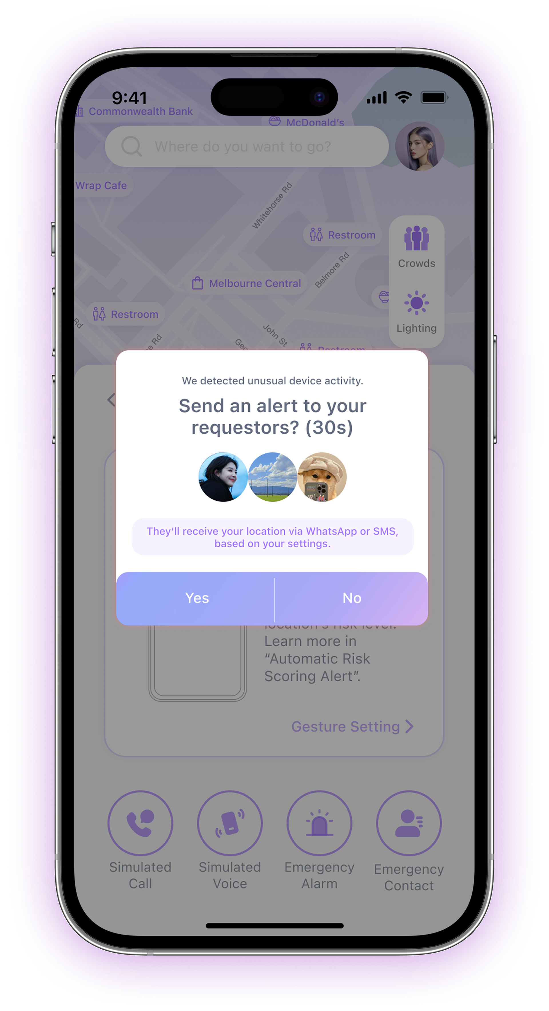
Many safety products escalate every alert to the highest level, either contacting emergency services or notifying family and friends immediately. But many participants expressed hesitation toward using these features, as the outcome felt disproportionate to the situation and difficult to control.

How might we provide support for different levels of perceived risk without immediately escalating every situation to an emergency response?

FIG 11. Emergency Group Alert

FIG 12. Emergency Location Sharing (User)
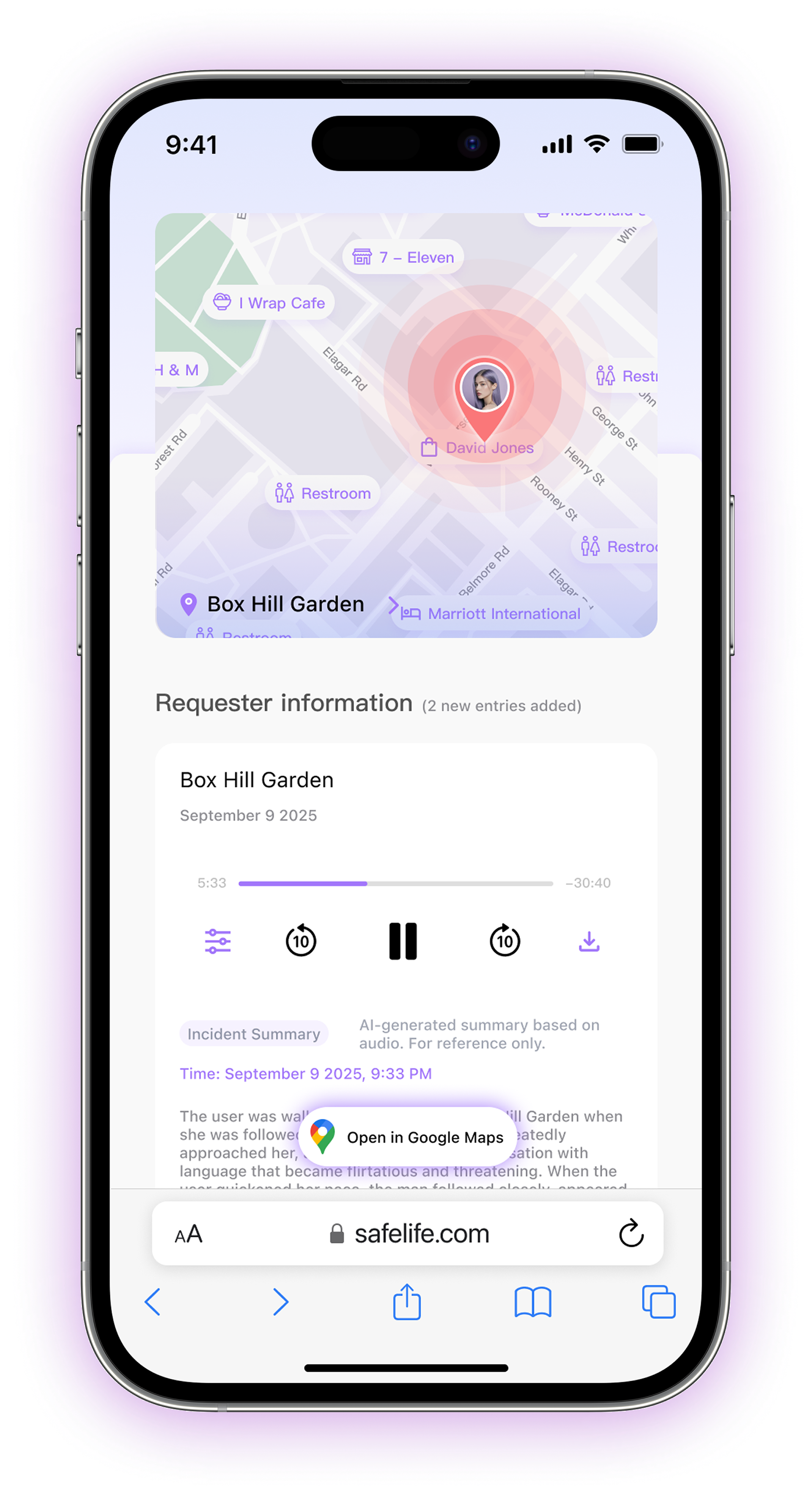
FIG 13. Live Incident Report (Contacts)
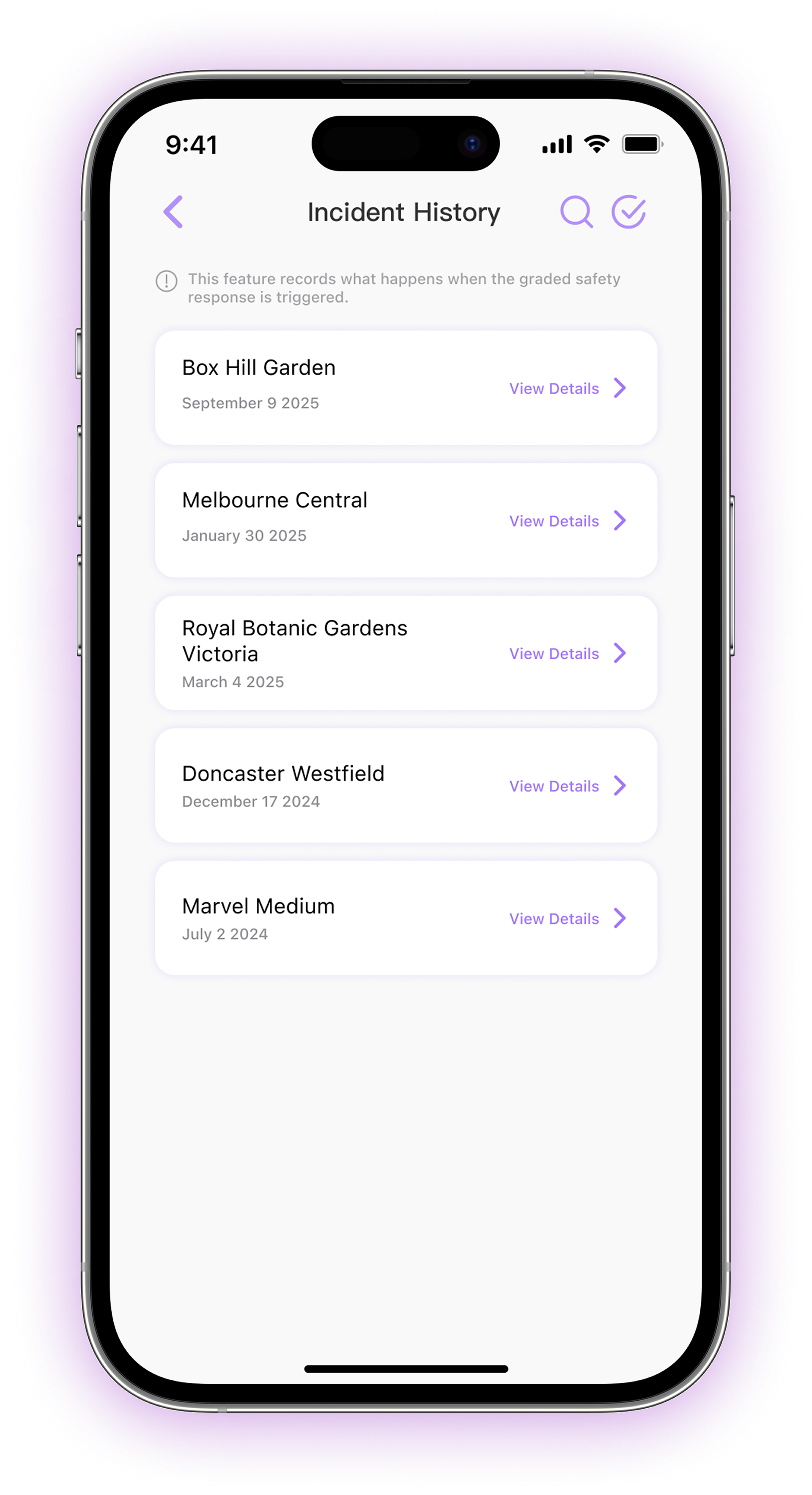
FIG 14. Incident Documentation (User)
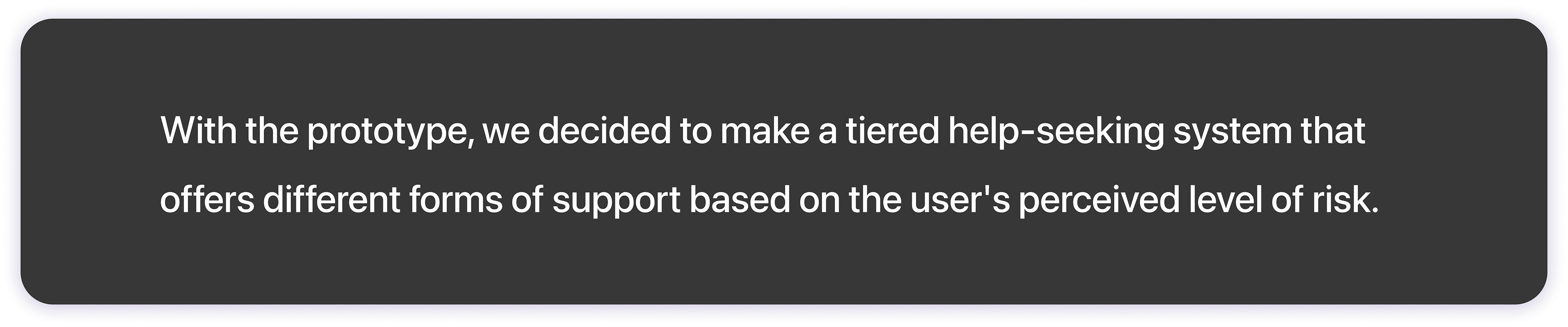
FIG 15. Design Decision 2

Why?
Not every unsafe situation requires emergency intervention. By providing multiple support pathways, users can seek assistance earlier and with greater confidence in the outcome.
03-3 Supporting Long-Term Platform Development

FIG 16. Women's Daily Behaviours

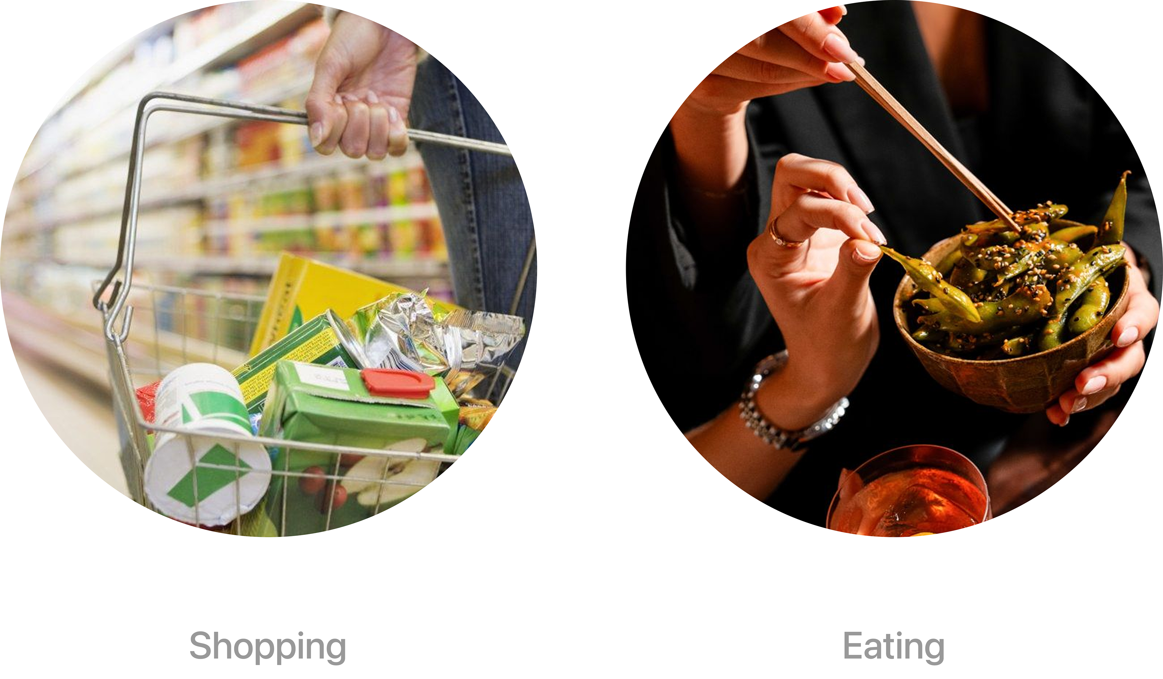
Research showed that women’s journeys are influenced by more than safety concerns alone. Shopping, dining, and commuting are often part of the same journey.
Challenge
Most safety products struggle with long-term user retention, as they are typically only used when users feel unsafe.
As a result, user activity declines over time, making it difficult to maintain a reliable and continuously updated source of safety information.

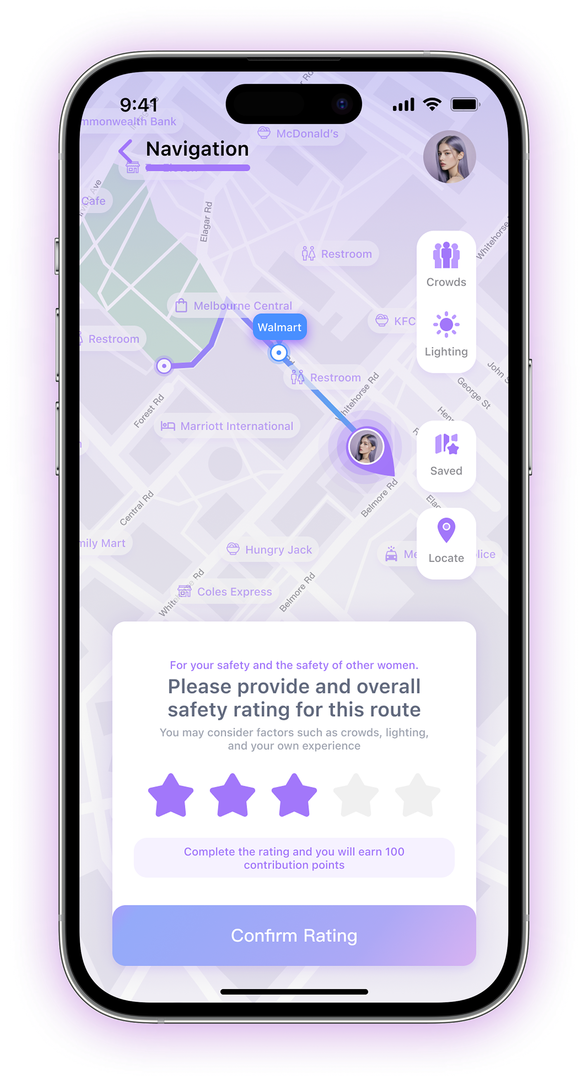
FIG 17. Users Can Rate the Safety of Each Journey and Earn Contributing Points
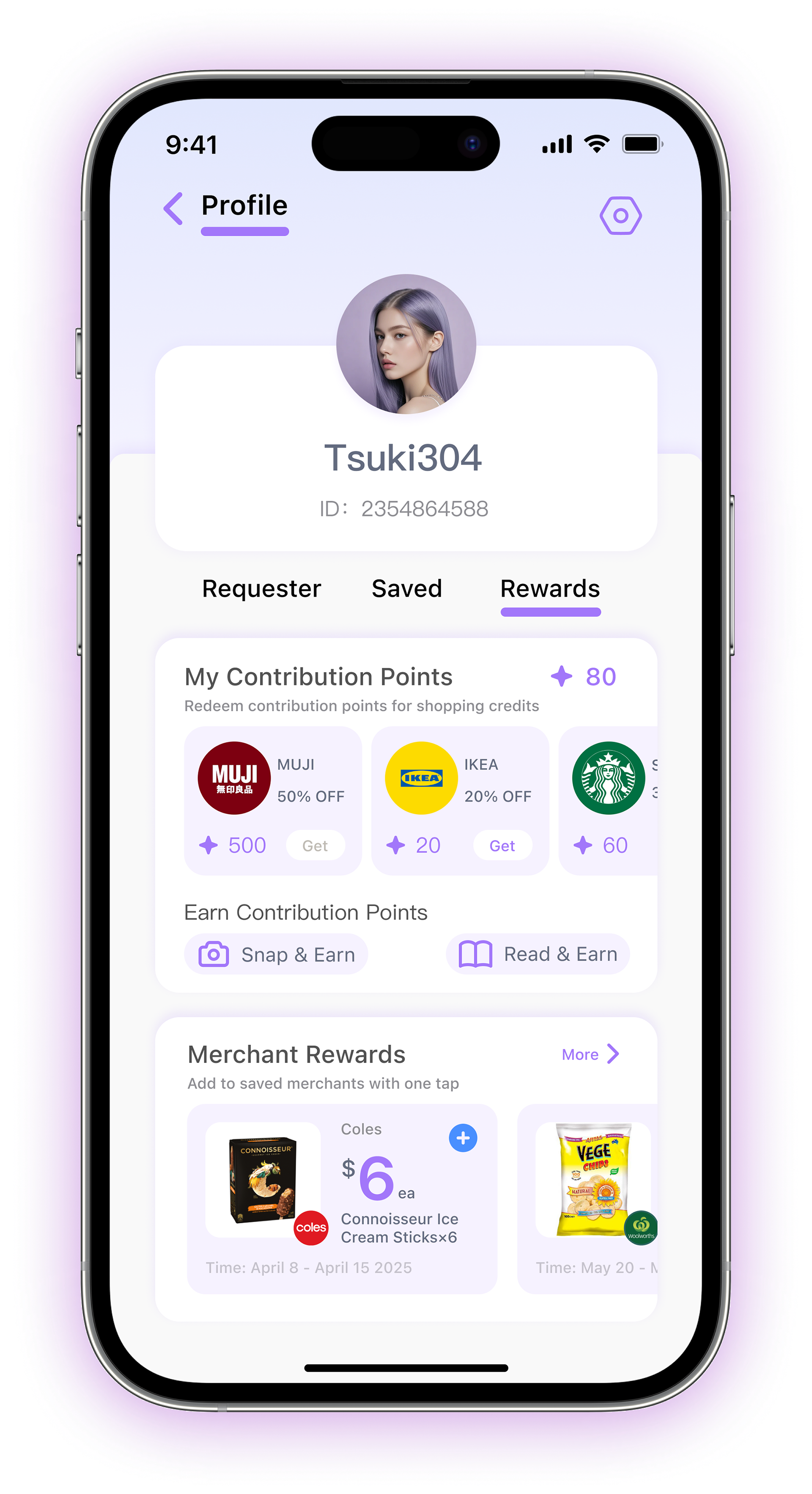
FIG 18. Contribution Points Can be Redeemed for Merchant Vouchers and Exclusive Offers

FIG 19. Design Decision 3

Why?
Rather than encouraging users to return only when they feel unsafe, this approach creates ongoing reasons to engage with the platform.
Users receive tangible benefits, businesses gain visibility and potential customers, and the platform continues to collect and update safety data over time.
04 FINAL USER EXPERIENCE
A Community-Powered Safety Ecosystem
SafeLife supports women before, during, and after their journeys through route planning, community support, emergency assistance, and continuous safety data contributions.
04-1 Identity Verification

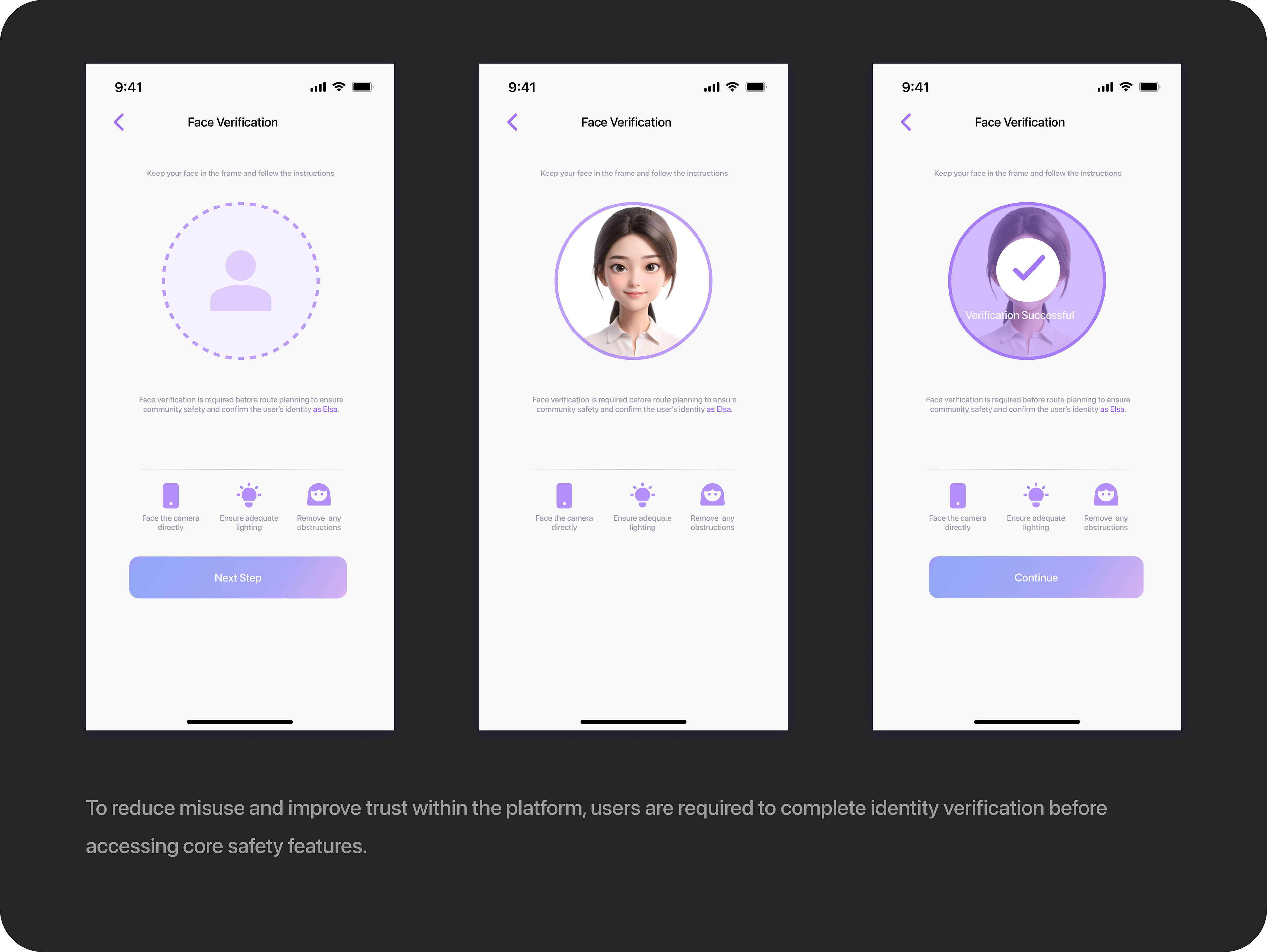
FIG 19. Users Must Complete Identity Verification Before Using Safety Features Involving Anonymoous Interactions, Ensuring a Safer Community 

04-2 Safer Route Planning

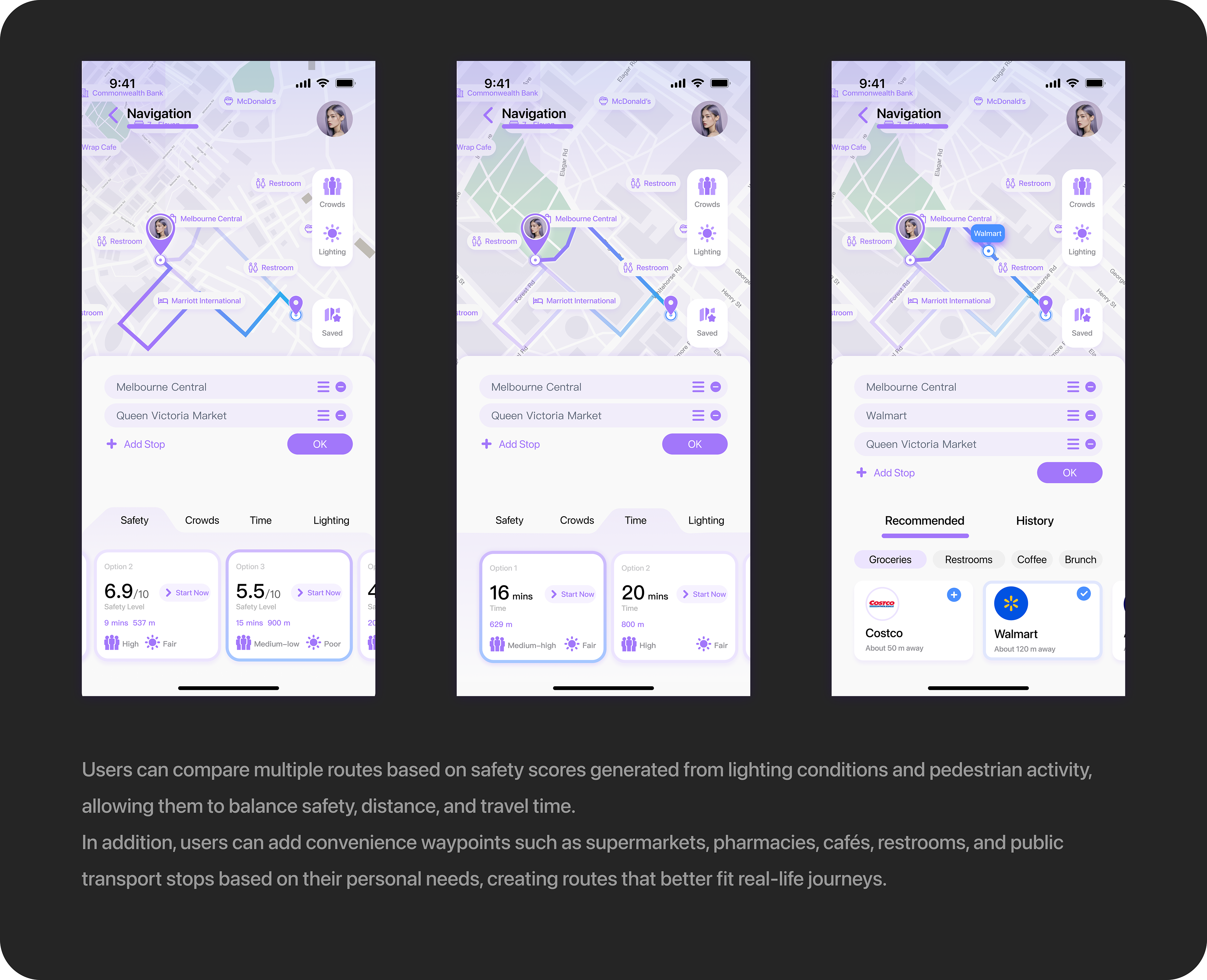
FIG 20. Route Navigation that Balances Safety and Everyday Needs

04-3 Safety Support Group

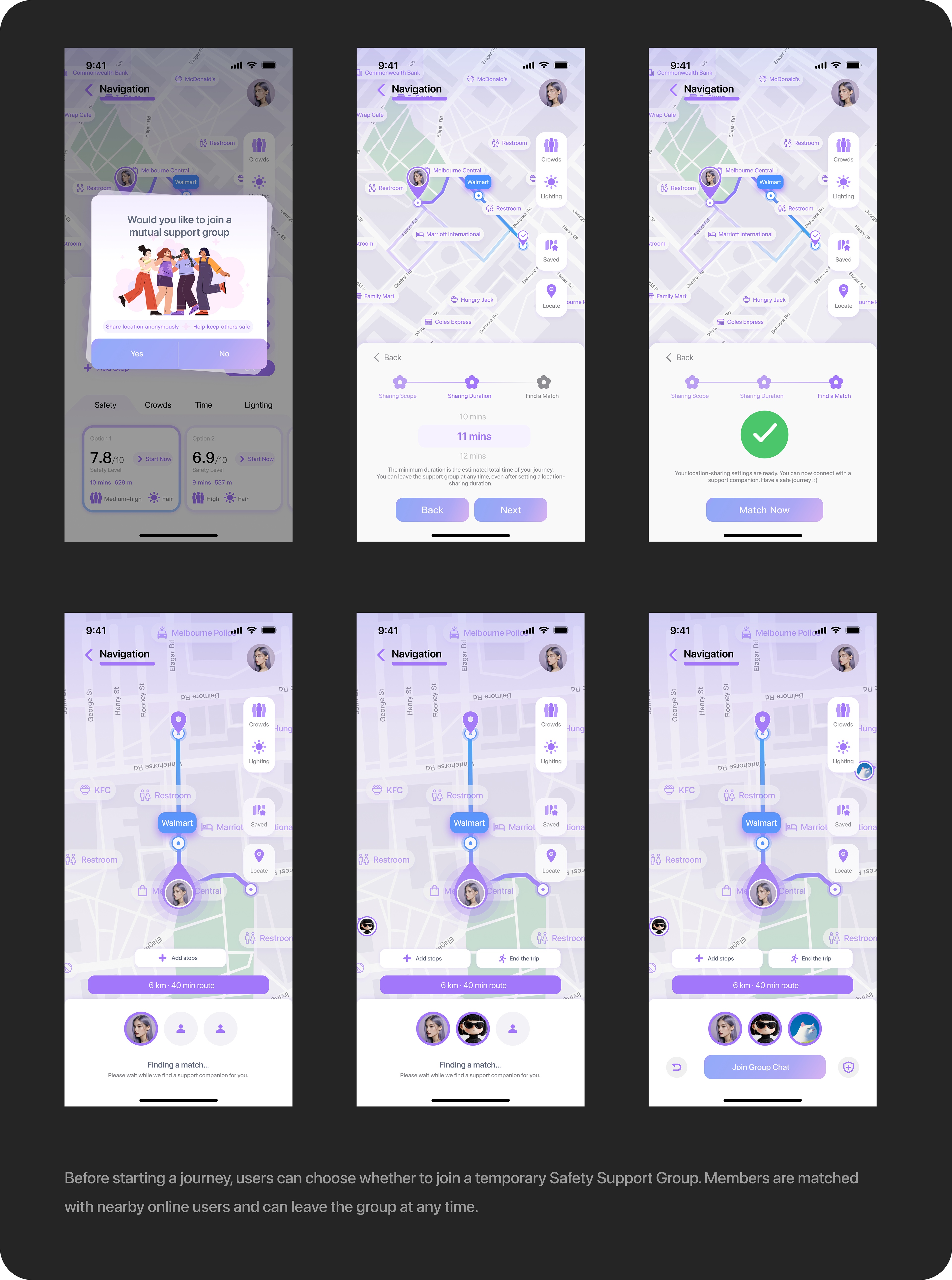
FIG 21. Users Can Cancel the Matching Process or Leave the Group at Any Time

04-4 Tiered Help-Seeking

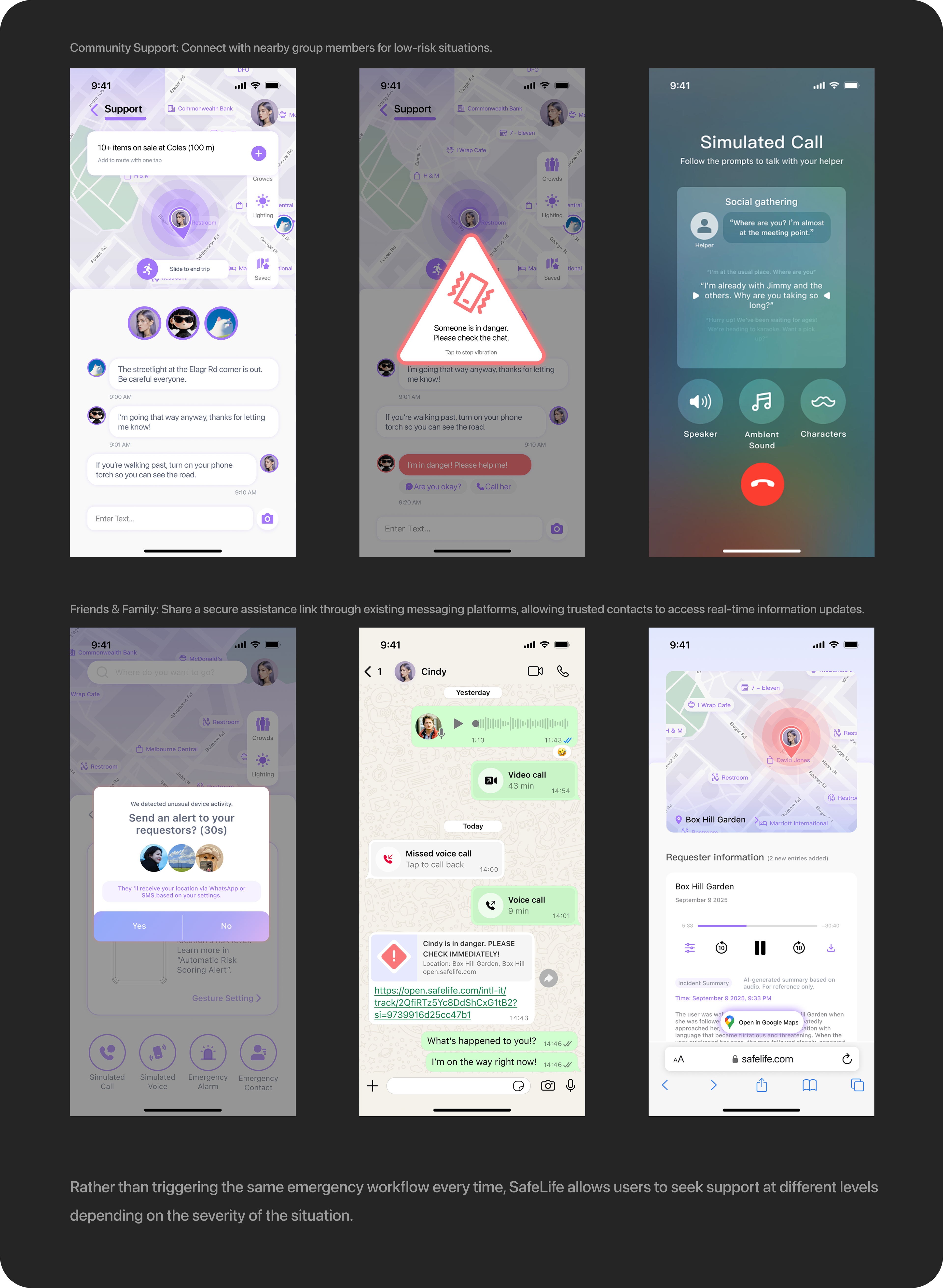
FIG 22. Tiered Emergency Options and Clear Information Sharing Give Users Greater Confidence When Seeking Help

04-5 Incident Records 

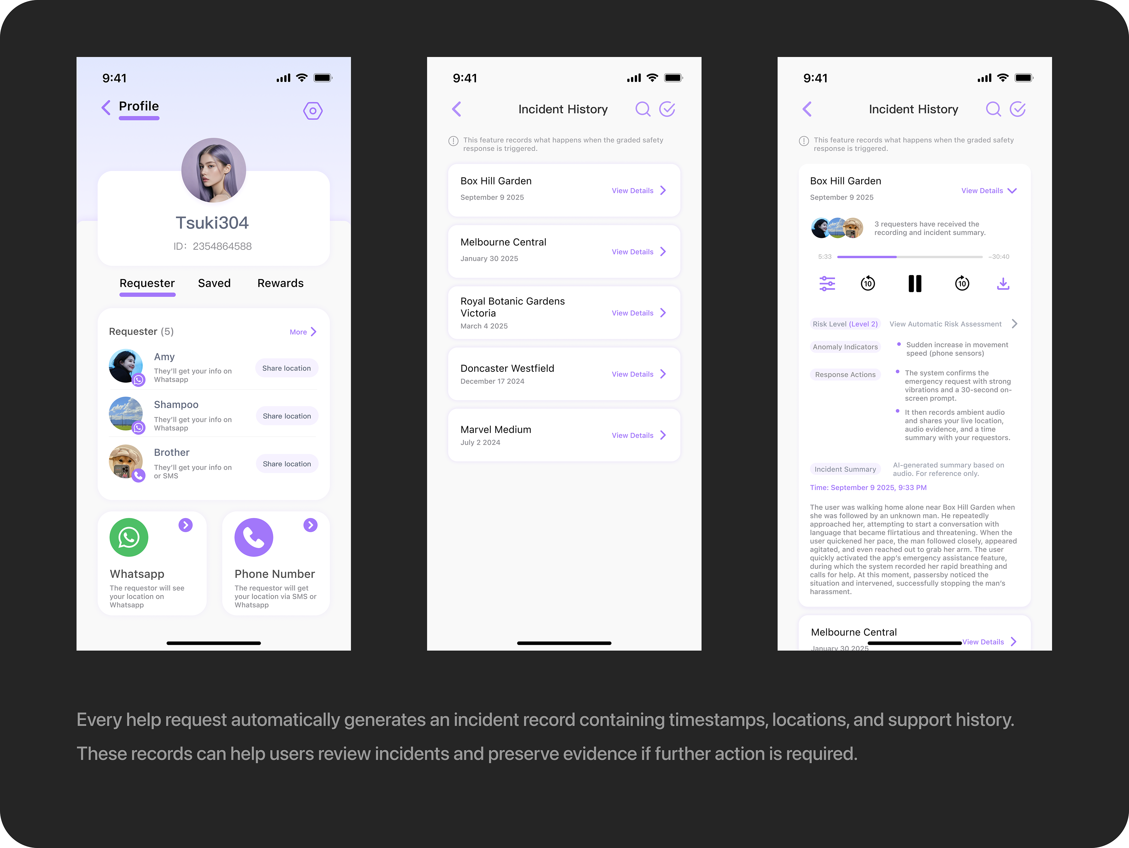
FIG 23. Emergency Incident Records

04-6 Contribution & Rewards

FIG 24. Safety Ratings, Safety Education, and Road Condition Reports Encourage User Participation and Support a Sustainable Platfrom

05 VISUAL DESIGN SYSTEM
05-1 Brand Identity

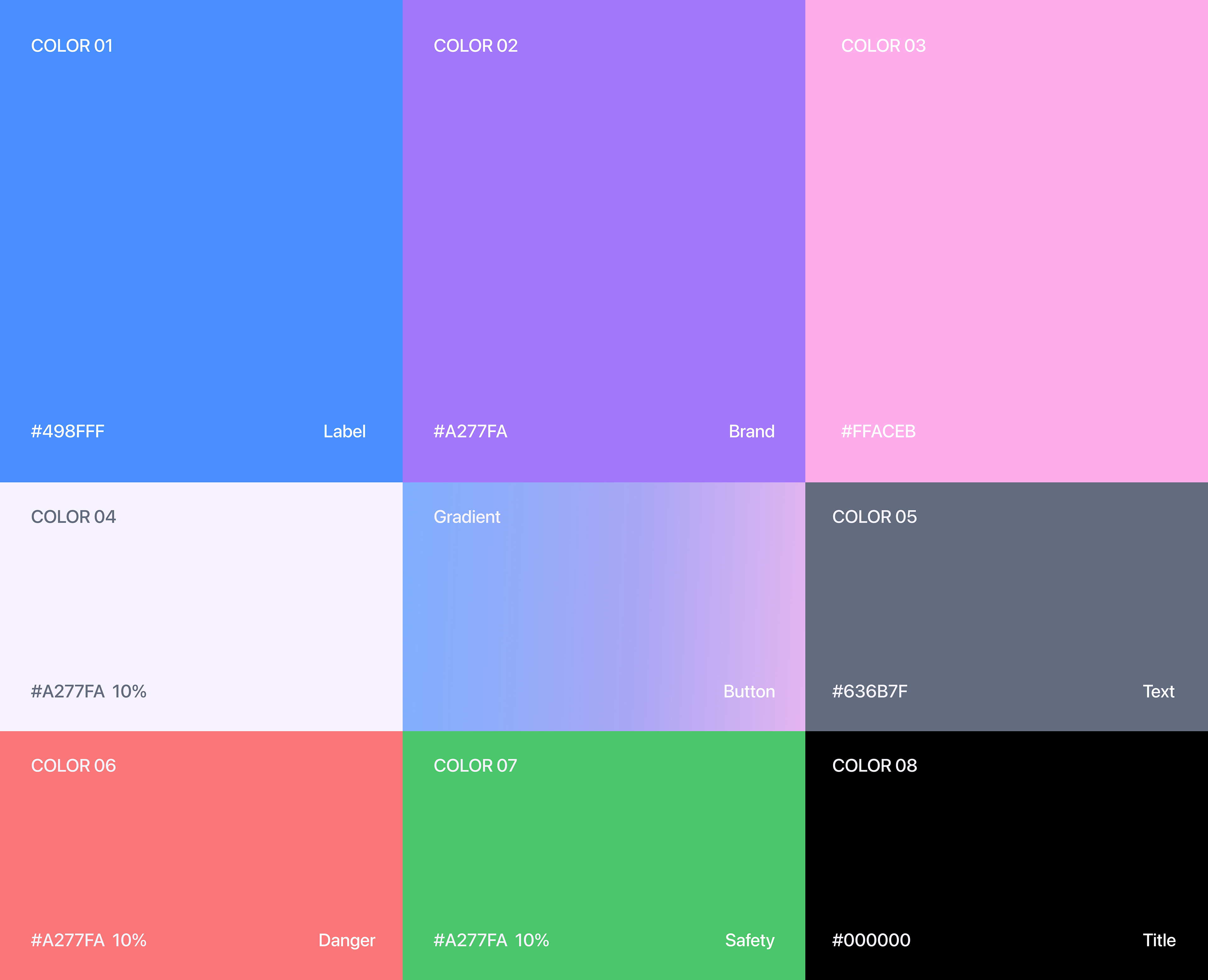
FIG 25. Primary Color System

Why Purple?
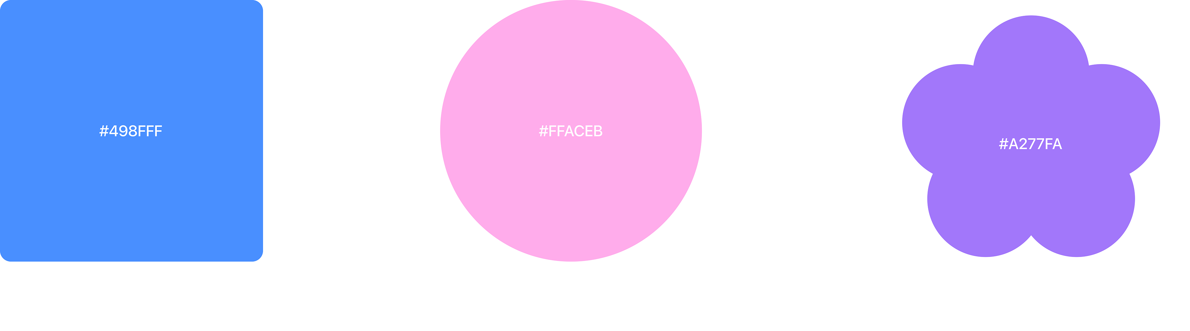
As a navigation product, the interface needed to communicate reliability and professionalism. At the same time, the product was designed specifically for women and required a softer and more approachable visual tone.
Purple was selected by combining the trust associated with blue and the warmth associated with pink (FIG.26).

FIG 26. Brand Color

05-2 Component System
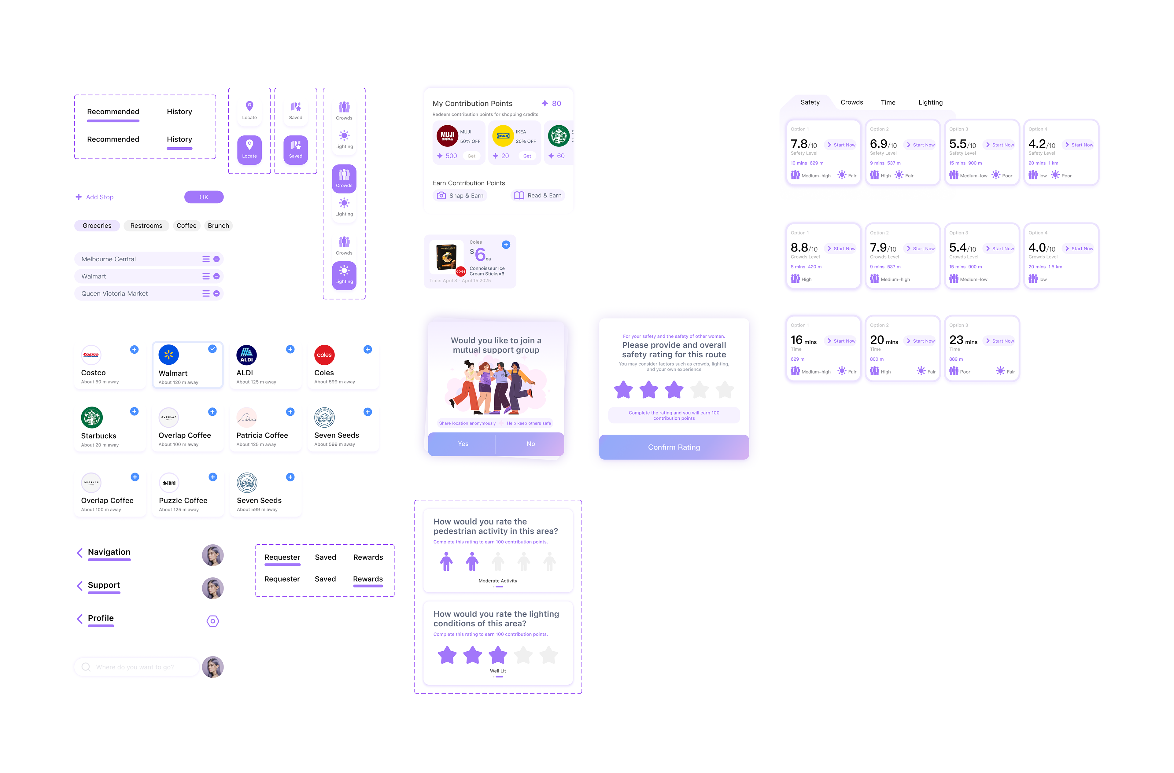
To maintain consistency across route planning, safety ratings, merchant rewards, and emergency support features, a reusable component system was established (FIG.27).

FIG 27. Component System

05-3 Information Hierarchy
Designing for Urgency
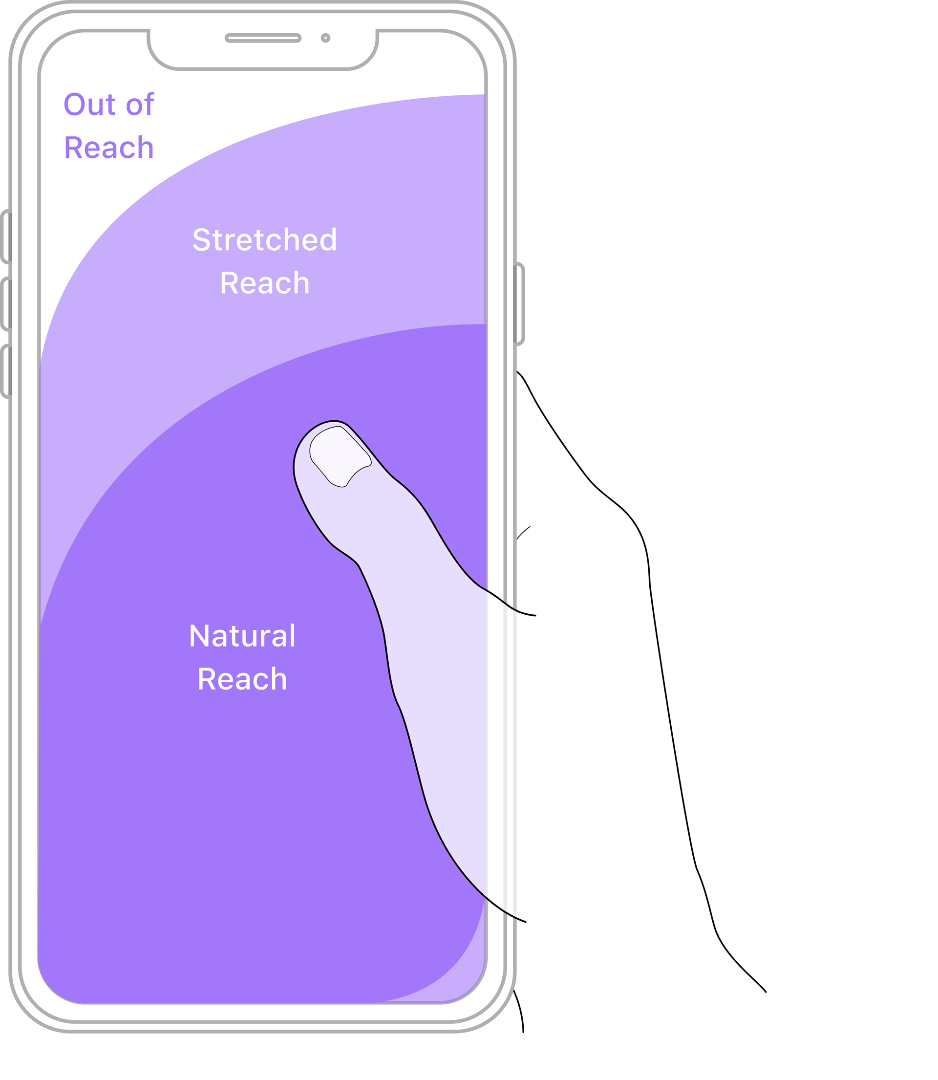
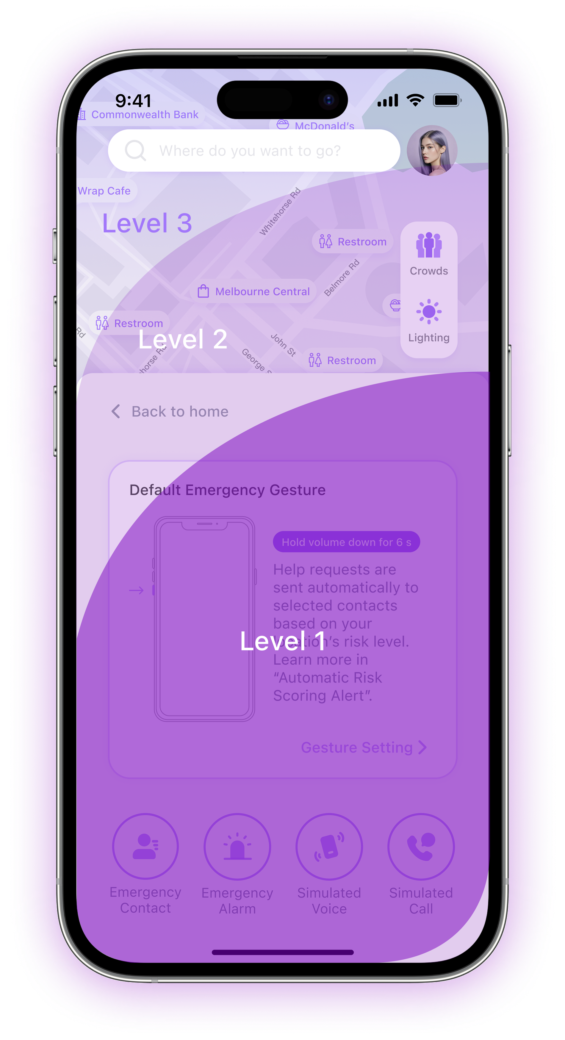
Given that safety-related interactions often occur in mobile and time-sensitive situations, the information hierarchy (FIG.28) was organised according to thumb reachability. 
Frequently used actions and critical safety features were prioritised within the most accessible area of the screen to reduce effort and improve responsiveness.

FIG 28. Information Hierachy Design
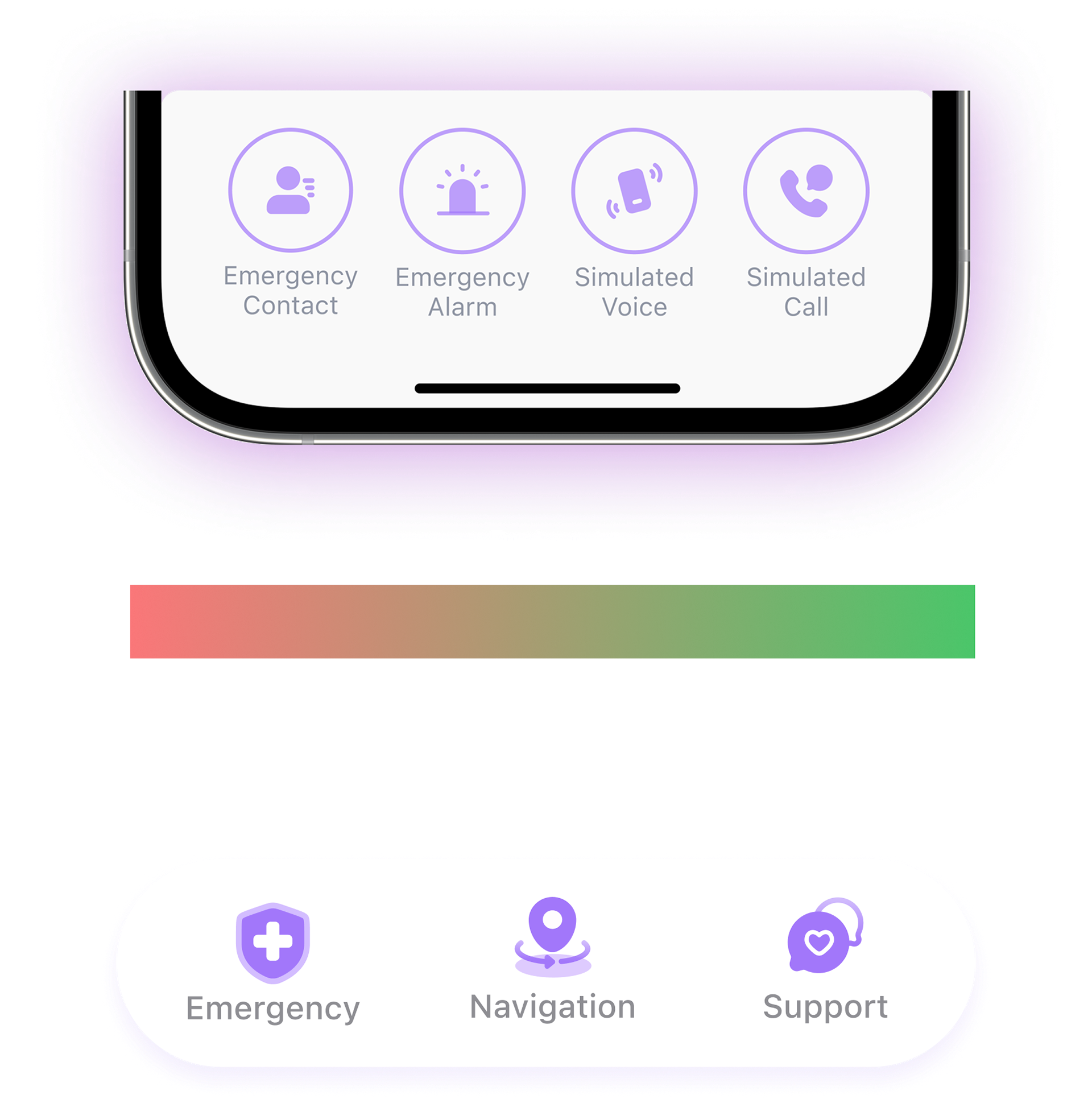
FIG 29. Information Hierachy Design

The layout and placement of all features were guided by both their priority and thumb reachability, with the most important actions positioned in the more reachable areas (FIG.29).
Integration Over Navigation
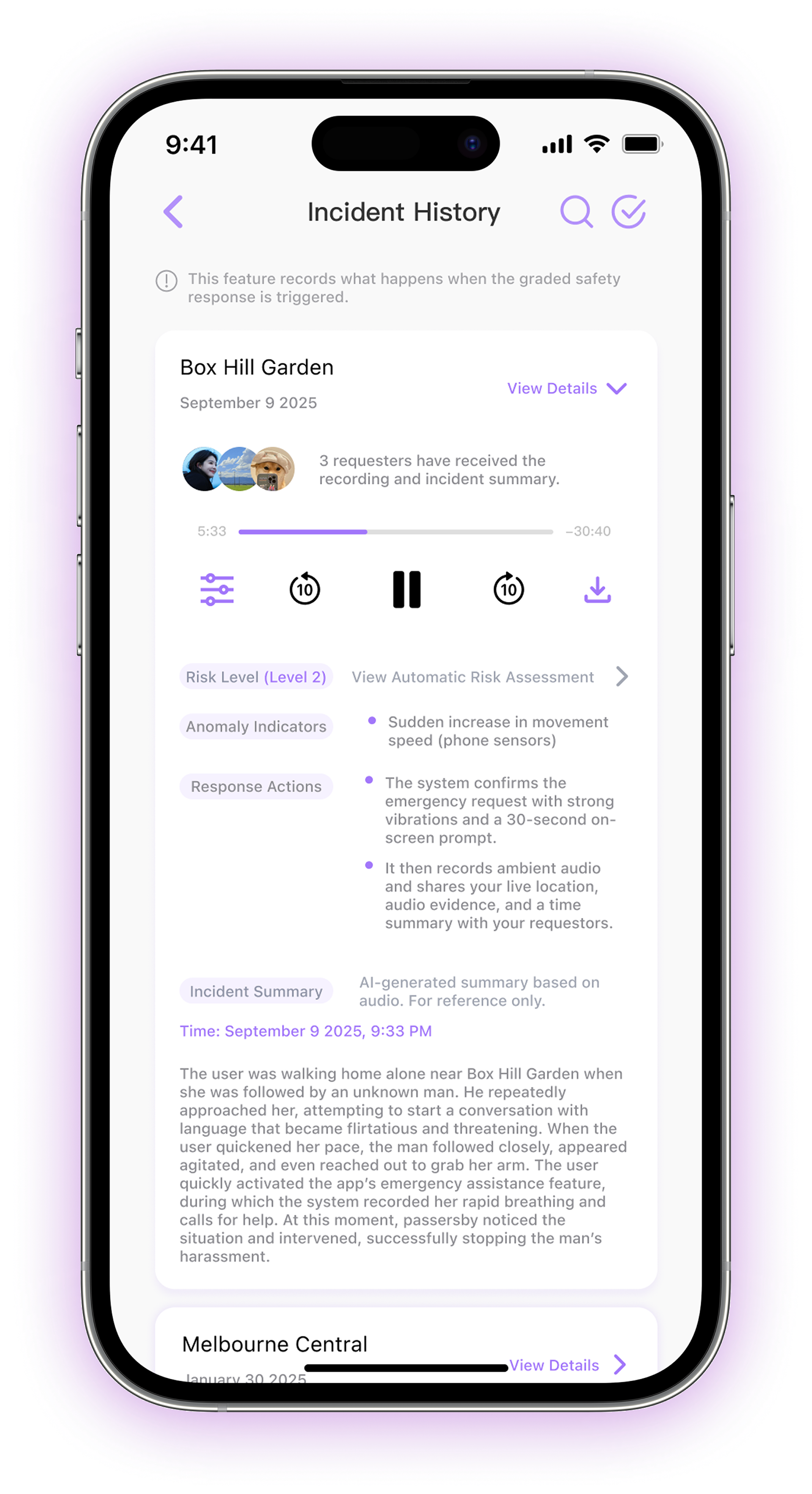
Detailed records were embedded within the existing flow, reducing unnecessary navigation while keeping information accessible (FIG.31).

FIG 30. Emergency Incident Records

FIG 31. Emergency Incident Records Details
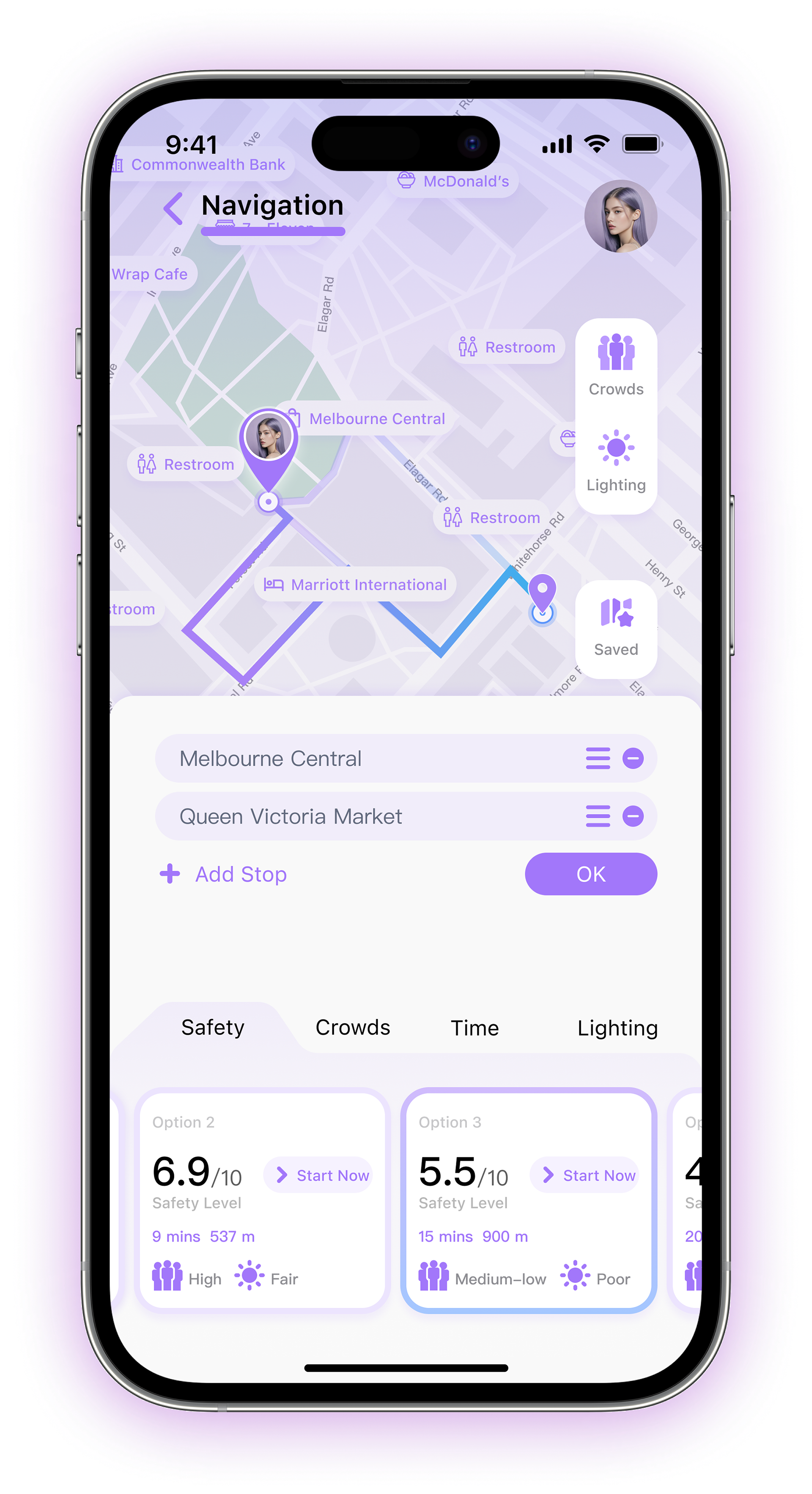
Context through Opacity
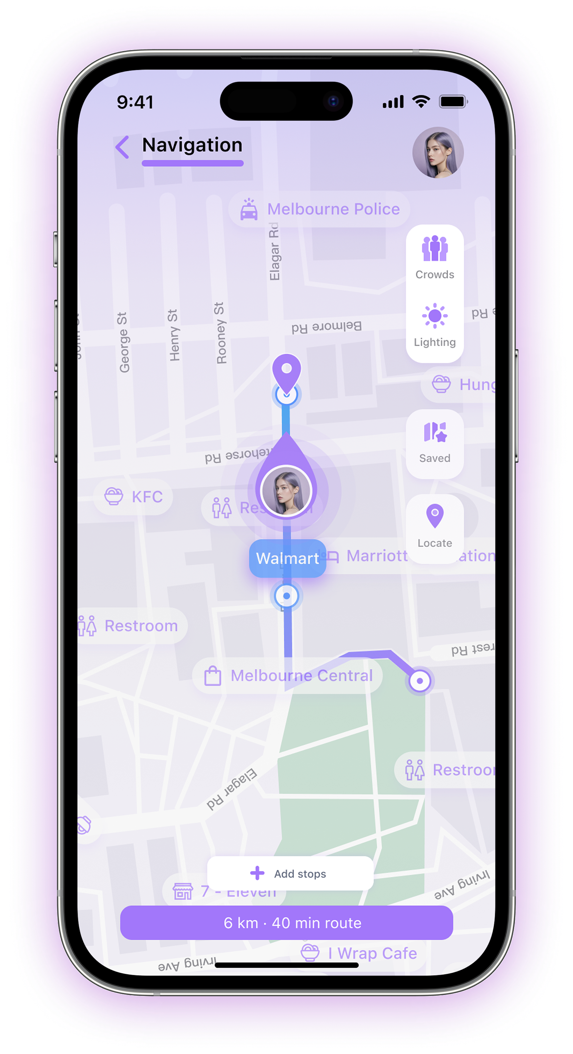
Nearby location labels remain at 100% opacity (FIG.32) during route planning to help users quickly identify and select stops along their journey, then reduce to 70% opacity (FIG.33) during navigation to keep the route visually dominant.

FIG 32. Before the Trip

FIG 33. During the Trip

06 PROJECT TAKEAWAYS
Skillsets
Back to Top